Additional Plots and Stats with ggquickeda
Samer Mouksassi
2026-03-26
Source:vignettes/AdditionalPlotsStats.Rmd
AdditionalPlotsStats.RmdIn this vignette we will expand what we have learned in the Introduction to ggquickeda vignette.
Multiple Y variables, recoding continuous variables to categories and Medina/PI:
This first section will illustrate how to use more than one y variable and how to generate a Median and a Ribbon showing a 95% Prediction interval (default) over the x variable (Time).
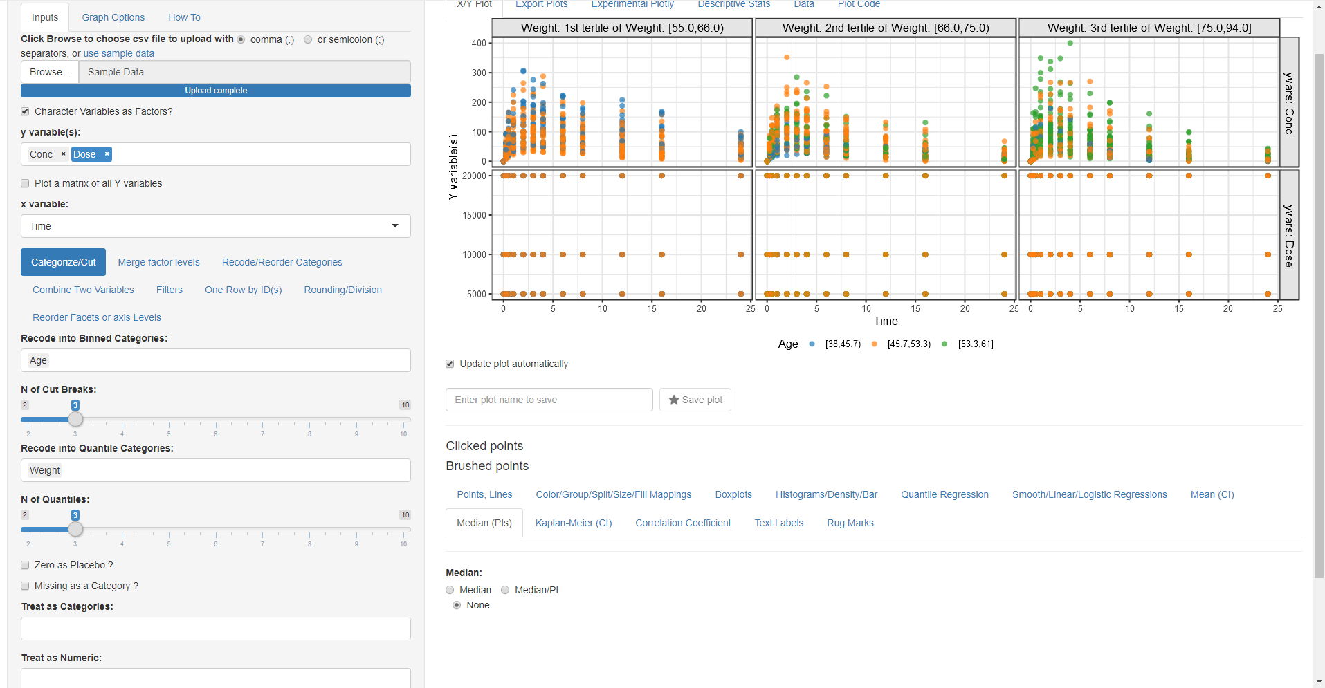
Using the built-in demo dataset:
- Change the mapped y variable(s) to Conc and Dose (ProTip: you can drag and drop the y variables to change their order)
- In the Categorize/cut subtab select Age to be cut into three binned categories
- In the Categorize/cut subtab select Weight to be cut into three quantiles categories
- Go to Color/Group/Split/Size/Fill Mappings and map Colour By and Fill By to Age and Column Split to Weight the Extra Row split is automatically set to yvars since you have selected more than one y variable.
- Go to Median PIs and select Median/PI and then you this get this plot:
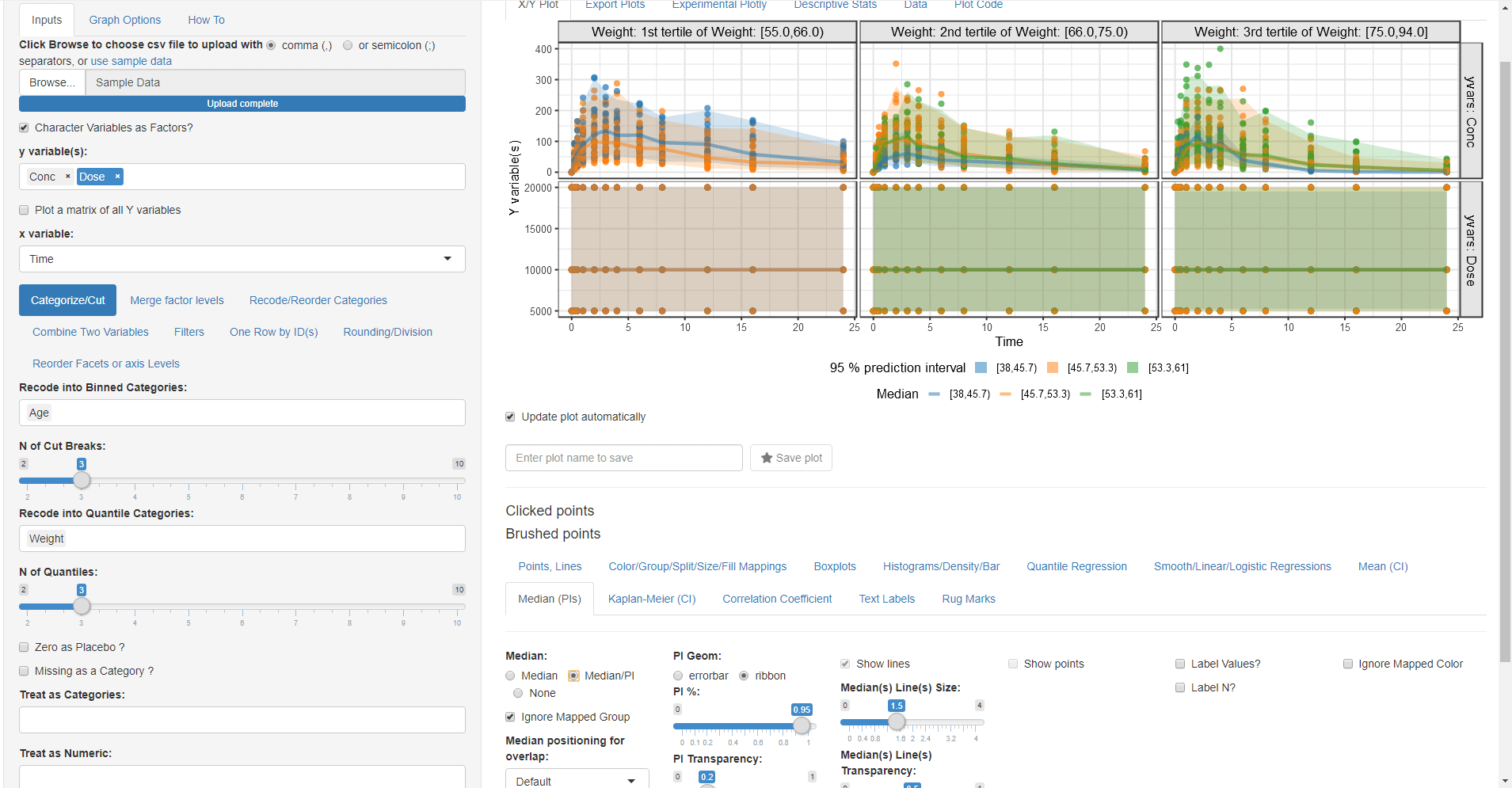
We can see that Dose does not change over time and that the highest Age category is only present in the second and third weight categories (older subjects have higher weights).
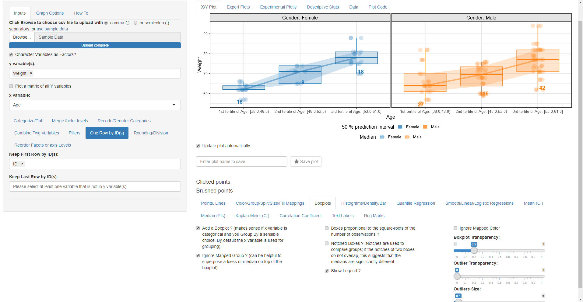
Boxplots, Median/PI, Mean:
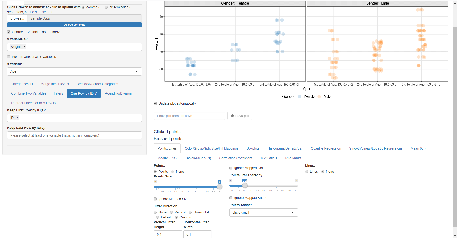
- Remove all previous mappings from column split, colour by etc.
- Change the mapped y variable(s) to Weight and x variable to Age and remove Weight from Recode into Quantile Categories and select Age instead.
- Go to Points, Lines and increase Point Size to 6 and make the transparency of the points equal to 0.1
- Explore the jitter position including the custom one
- Go to Color/Group/Split/Size/Fill and map Color By:, Group By: Fill By: and Column Split: to Gender
- Go to One Row by ID(s) and select ID so we keep one row by ID
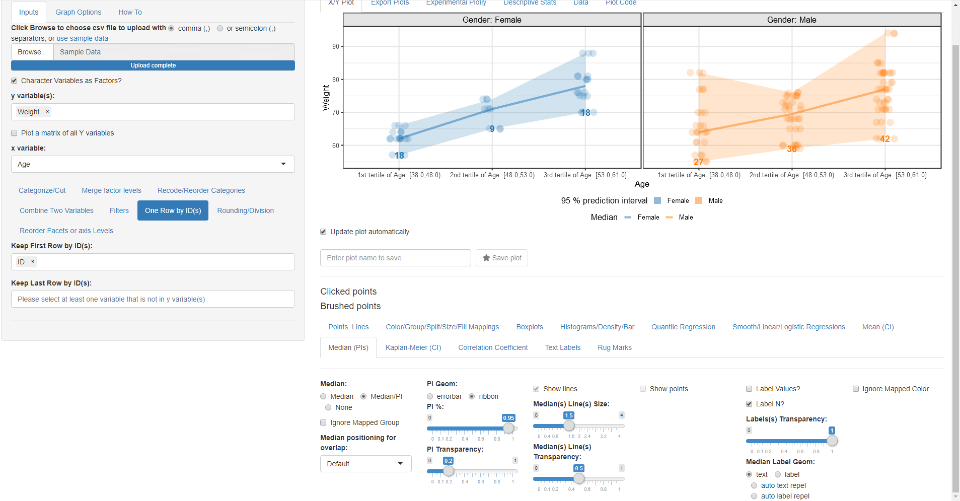
- Go To Median PI and uncheck Ignore Mapped Group so the Median PI uses the mapped Gender Group By:.
- Try to experiment what Label Values? and Label N? do Keep Label N? checked.
- Apply all the selected options in the screenshot
- Go to Boxplots and check the Add a Boxplot? checkbox.
- Go back to Median PI and choose the PI to be 50% so it will be at the boxplot box edges.
- Go to Boxplots try to change the size of outliers and to remove the boxplot legend.
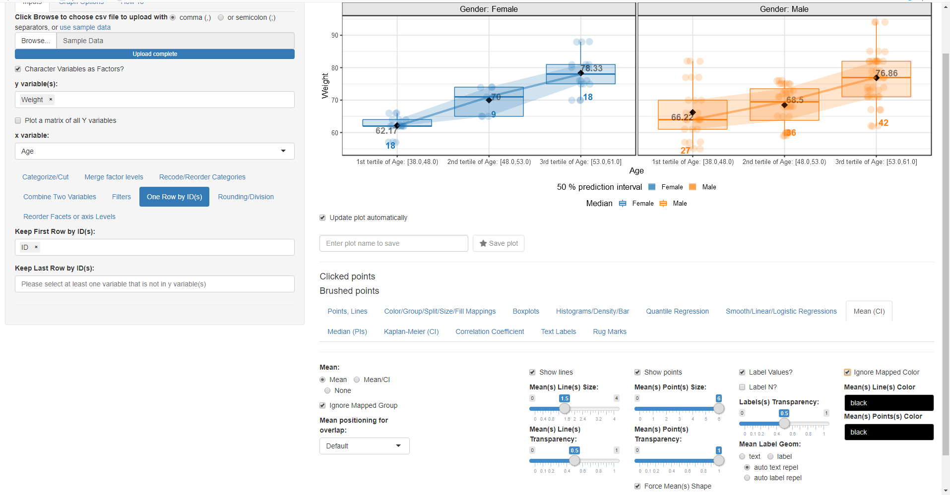
- Next go to the Mean (CI) menu select Mean and check Show points and Force Mean(s) Shape (Diamond will be used by default)
- Try to play with the various shapes options and or the size of the mean point(s).
- Check Label Values? and Check Ignore Mapped Color and choose Mean Label Geom as auto text repel.
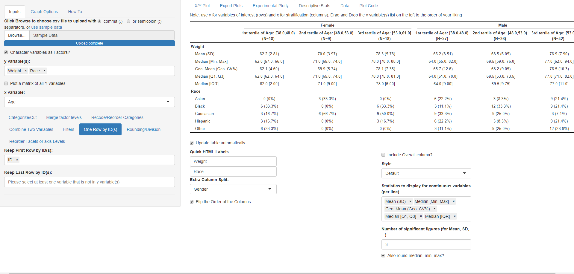
Continuous and categorical variables descriptive stats:
In the following part we will generate a descriptive stats table that reflect the plot that we just did and then add Race.
- Click on the Descriptive Stats Tab
- Map Extra Column Split to Gender and explore with the Flip the order of the columns checkbox
- Try to add more statistics in the Statistics to display for continuous variables
- Add Race to the y variable(s) to see the statistics for a categorical variable
Univariate Plots:
Remove all y variable(s) and any column splits keeping Age as x variable gives a barplot since Age has been categorized.
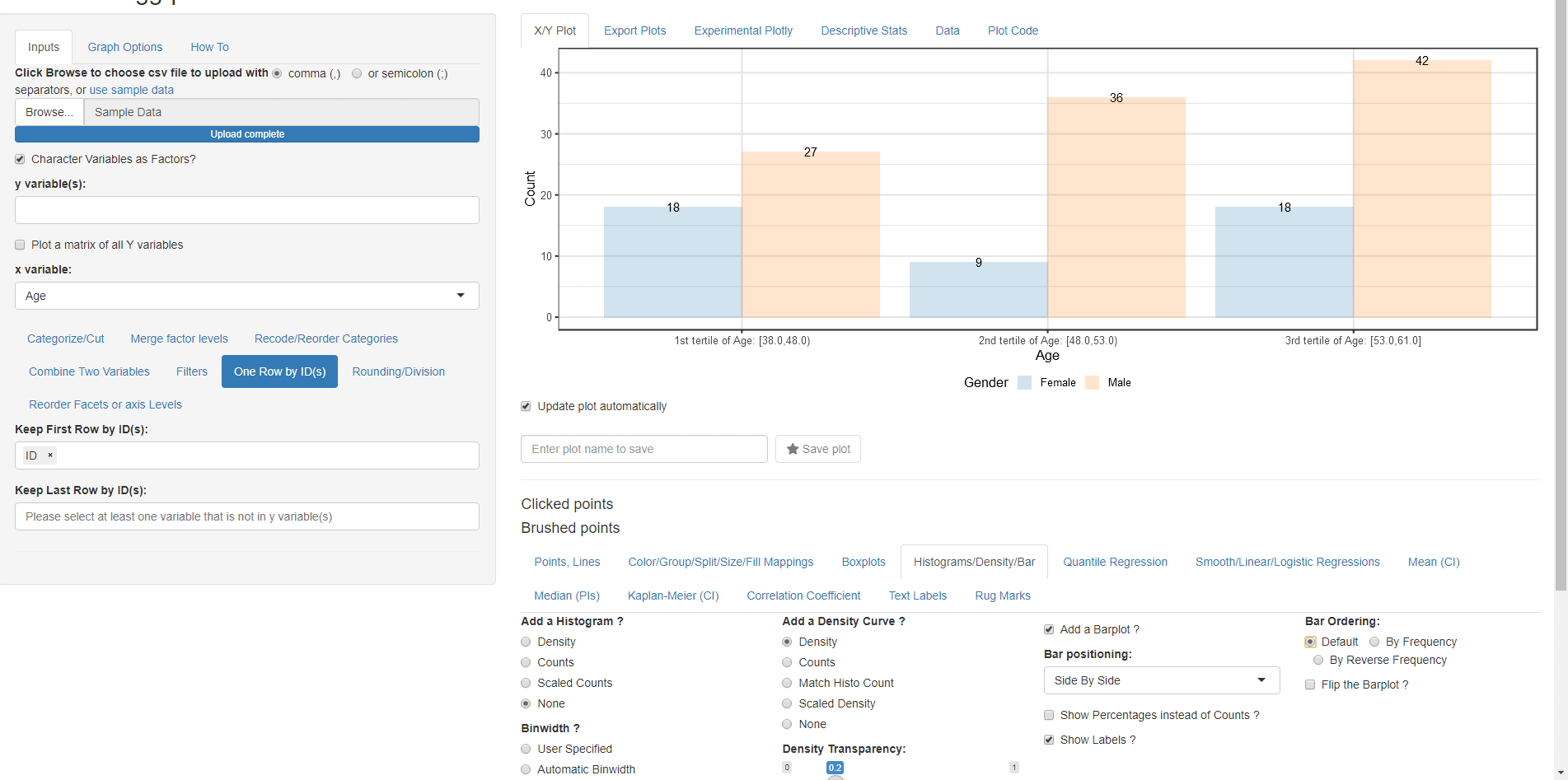
Remove Age from Recode into Quantile Categories so it goes back to a numeric variable and the generated distribution will be a density plot instead of a barplot. Reapply the ID in One Row by ID(s) as the data manipulation steps are sequential and changing something in the first tab will reset the steps in the subsequent ones.
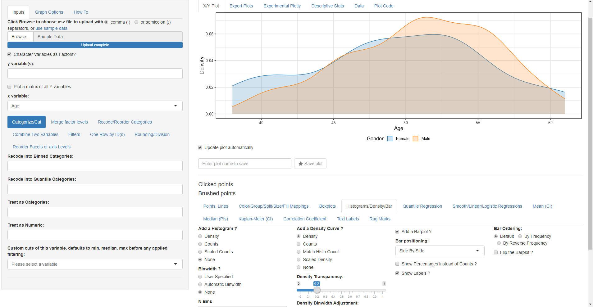
Play with the options in the Histograms/Density/Bar to see how they affect the generated plots.