Welcome!
This is the first post in my personal blog. I have been working in the Modeling and Simulation field for 20 years and I started this blog to share my experience and how general solutions were developed to tackle specific and more general problems. I will keep this first post short and leave you with one of the dose exposure figures (using dummy data) that I developed for an FDA submission 15 years ago. Through out the years these visuals has evolved and are now part of my ggquickeda package that will be covered in future posts.
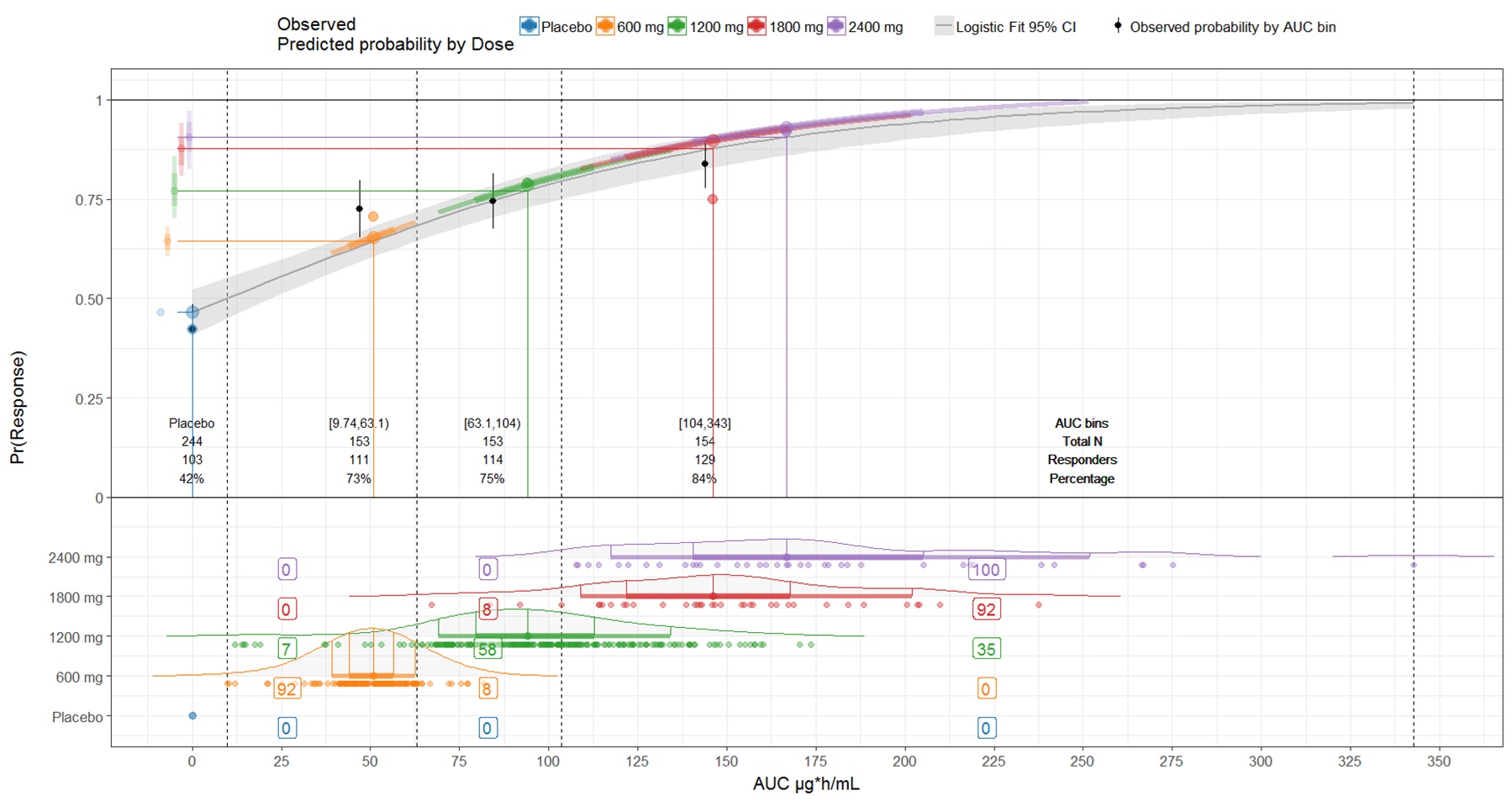
This visual include several components:
distribution of exposures (AUC) by dose level
for each distribution we show the percentage of it falling within a specific quantile of AUC
in the middle we have a table detailing for Placebo and each Quartile: AUC bins, Total N of patients, N of Responders, and the observed Percentage of response
in the upper panel a logistic fit and its 95%CI of the probability of clinical response versus AUC is shown.
The predicted response by dose level at the 10th, 25th, median,75th and 90th of exposure is shown and projected on the logistic curve
The predicted response is also projected on Y axis for head to head comparison across doses and to appreciate the saturation at the highest dose levels/exposures