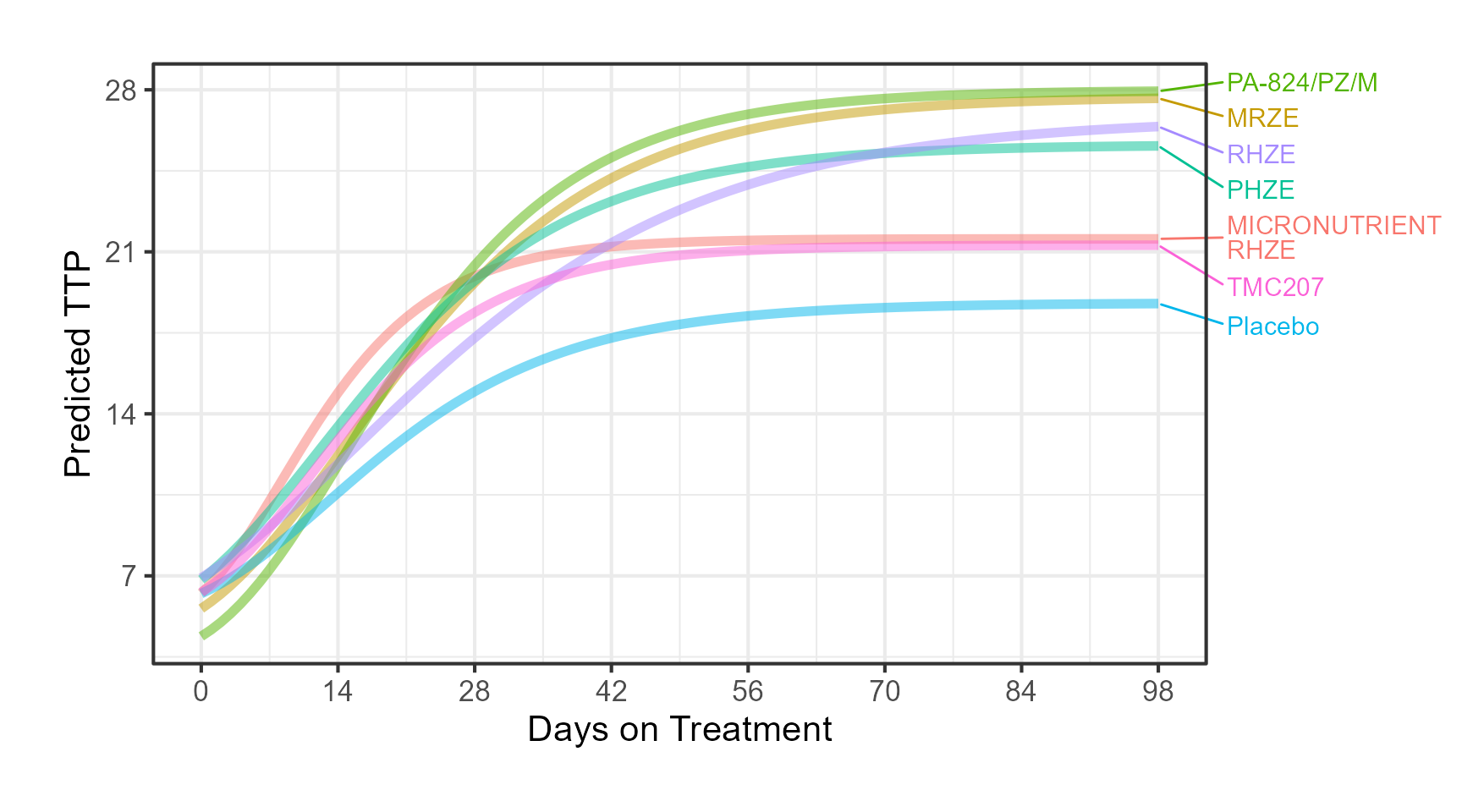
alldata <- makegompertzModelCurve(TRT="RHZE",
tvOffset = Thetatrt %>%
filter(label=="RHZE") %>%
pull(tvE0),
tvAlpha = Thetatrt %>%
filter(label=="RHZE") %>%
pull(tvAlpha),
tvBeta = Thetatrt %>%
filter(label=="RHZE") %>%
pull(tvBeta),
tvGamma = Thetatrt %>%
filter(label=="RHZE") %>%
pull(tvGam))
alldata <- alldata %>%
group_by(TRT) %>%
mutate(
TIMETTPFLAG = ifelse(Time >= TIMETTPMAX50, 1, 0) ,
cumsumttpflag = cumsum(TIMETTPFLAG)
)
pointsdata <- alldata %>%
group_by(TRT) %>%
filter(cumsumttpflag == 1)
pointsdata2 <- alldata %>%
group_by(TRT) %>%
filter(Time == TIMEEFFMAX50)
alldataauc<- alldata[alldata$Time<=28,]
alldataMRZE <- makegompertzModelCurve(TRT="MRZE",
tvOffset = Thetatrt %>% filter(label=="MRZE") %>% pull(tvE0),
tvAlpha = Thetatrt %>% filter(label=="MRZE") %>% pull(tvAlpha),
tvBeta = Thetatrt %>% filter(label=="MRZE") %>% pull(tvBeta),
tvGamma = Thetatrt %>% filter(label=="MRZE") %>% pull(tvGam))
alldataMRZE <- alldataMRZE %>%
group_by(TRT) %>%
mutate(
TIMETTPFLAG = ifelse(Time >= TIMETTPMAX50, 1, 0) ,
cumsumttpflag = cumsum(TIMETTPFLAG)
)
pointsdataMRZE <- alldataMRZE %>%
group_by(TRT) %>%
filter(cumsumttpflag == 1)
pointsdata2MRZE <- alldataMRZE %>%
group_by(TRT) %>%
filter(Time == TIMEEFFMAX50)
alldataaucMRZE<- alldataMRZE[alldataMRZE$Time<=28,]
alldata<- rbind(alldata,alldataMRZE)
pointsdata<- rbind(pointsdata,pointsdataMRZE)
pointsdata2<- rbind(pointsdata2,pointsdata2MRZE)
alldataauc<- rbind(alldataauc,alldataaucMRZE)
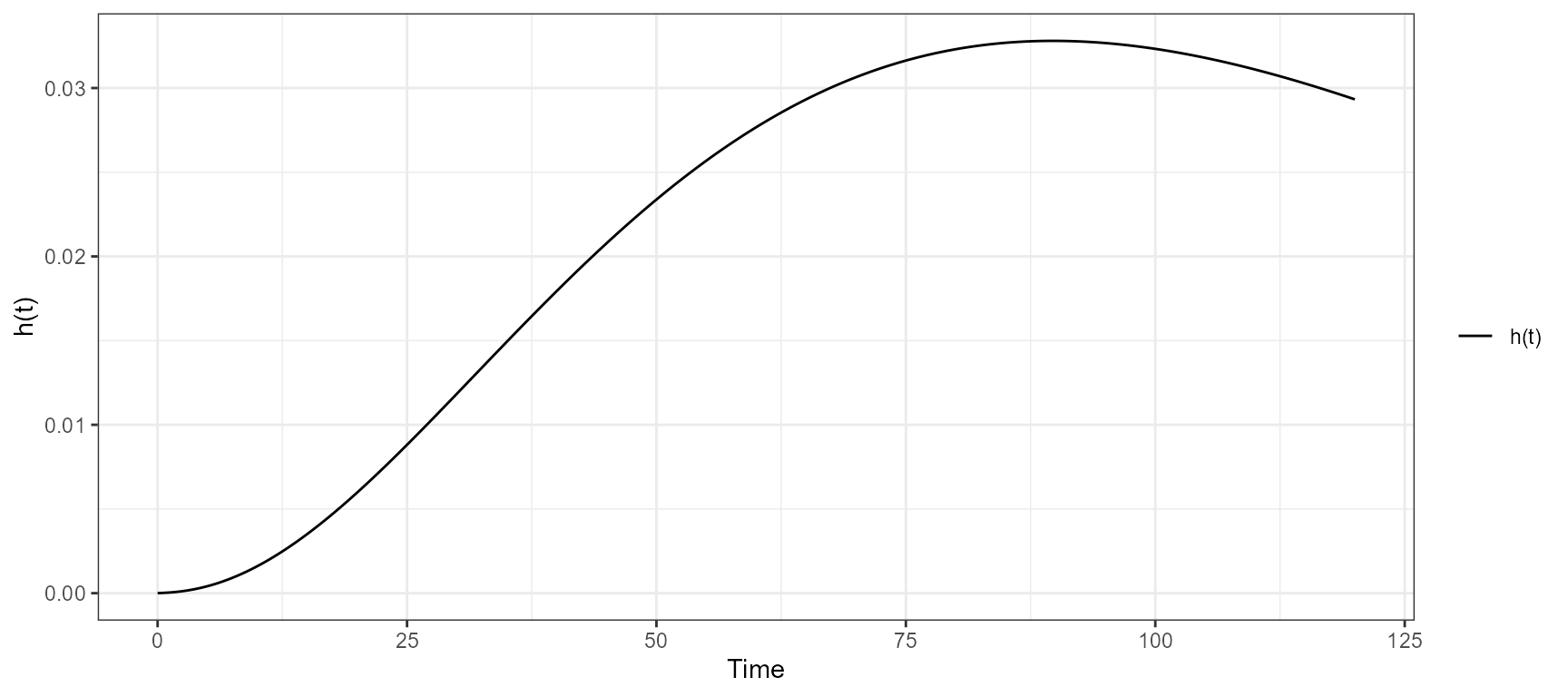
library(plotly)
p <-
plot_ly(
alldata,
x = ~ Time,
y = ~ TTPPRED,
type = 'scatter',
mode = 'lines',
name = 'TTP(t)',
legendgroup = "TTP(t)",
line = list(color = toRGB("black", alpha = 0.5), width = 5),
linetype = ~ TRT,
color = I('black'),
hoverinfo = 'text',
text = ~ paste(
"</br> Treatment: ",
TRT,
'</br> Time: ',
round(Time, 1),
'</br> TTP(t): ',
round(TTPPRED, 1)
)
) %>%
add_ribbons(
data = alldataauc,
x = ~ Time ,
ymin = 0,
ymax = ~ TTPPRED,
name = 'AUC28',
legendgroup = "AUC<sub>28</sub>",
fillcolor = ~ TRT ,
line = list(color = 'blue'),
linetype = ~ TRT,
opacity = 0.2,
hoverinfo = 'none'
) %>%
add_markers(
data = pointsdata2 ,
x = 0,
y = ~ TTP0,
type = 'scatter',
mode = 'markers',
marker = list(
color = toRGB("black", alpha = 0.7),
size = 20,
symbol = "circle"
),
name = "TTP(0)",
legendgroup = "TTP(0)",
inherit = FALSE,
hoverinfo = 'text',
text = ~ paste("</br> Treatment: ", TRT,
'</br> TTP(0): ', round(TTP0, 1))
) %>%
add_markers(
data = pointsdata ,
x = ~ TIMETTPMAX50,
y = ~ TTPMAX50,
type = 'scatter',
mode = 'markers',
marker = list(
color = toRGB("black", alpha = 0.5),
size = 20,
symbol = "triangle-up"
),
name = "TTP<sub>50</sub>",
legendgroup = "TTP<sub>50</sub>",
inherit = FALSE,
hoverinfo = 'text',
text = ~ paste(
"</br> Treatment: ",
TRT,
'</br> Time to TTP<sub>50</sub>: ',
round(TIMETTPMAX50, 1),
'</br> TTP<sub>50</sub>: ',
round(TTPMAX50, 1)
)
) %>%
add_markers(
data = pointsdata2 ,
x = ~ TIMEEFFMAX50,
y = ~ EEFFMAX50,
type = 'scatter',
mode = 'markers',
marker = list(
color = toRGB("black", alpha = 0.3),
size = 20,
symbol = "diamond"
),
name = "EFF<sub>50</sub>",
legendgroup = "EFF<sub>50</sub>",
inherit = FALSE,
hoverinfo = 'text',
text = ~ paste(
"</br> Treatment: ",
TRT,
'</br> Time to EFF<sub>50</sub>: ',
round(TIMEEFFMAX50, 1),
'</br> EFF<sub>50</sub>: ',
round(EEFFMAX50, 1)
)
) %>%
add_lines(
data = alldata ,
x = ~ Time,
y = ~ TTPINF,
type = 'scatter',
mode = 'lines',
name = 'TTP(\u221E)',
line = list(color = toRGB("black", alpha = 0.5), width = 5),
linetype = ~ TRT,
color = I('black'),
legendgroup = "TTP(\u221E)",
inherit = FALSE,
hoverinfo = 'text',
text = ~ paste("</br> Treatment: ", TRT,
'</br> TTP(\u221E) ', round(TTPINF, 1))
) %>%
layout(
xaxis = list(
title = 'Days Post Start of Treatment',
ticks = "outside",
autotick = TRUE,
ticklen = 5,
range = c(-2, 121),
gridcolor = toRGB("gray50"),
showline = TRUE
) ,
yaxis = list (
title = 'TTP (t), Days' ,
ticks = "outside",
autotick = TRUE,
ticklen = 5,
gridcolor = toRGB("gray50"),
showline = TRUE)
# ) ,
# legend = list(
# orientation = 'h',
# xanchor = "center",
# y = -0.25,
# x = 0.5
# )
)
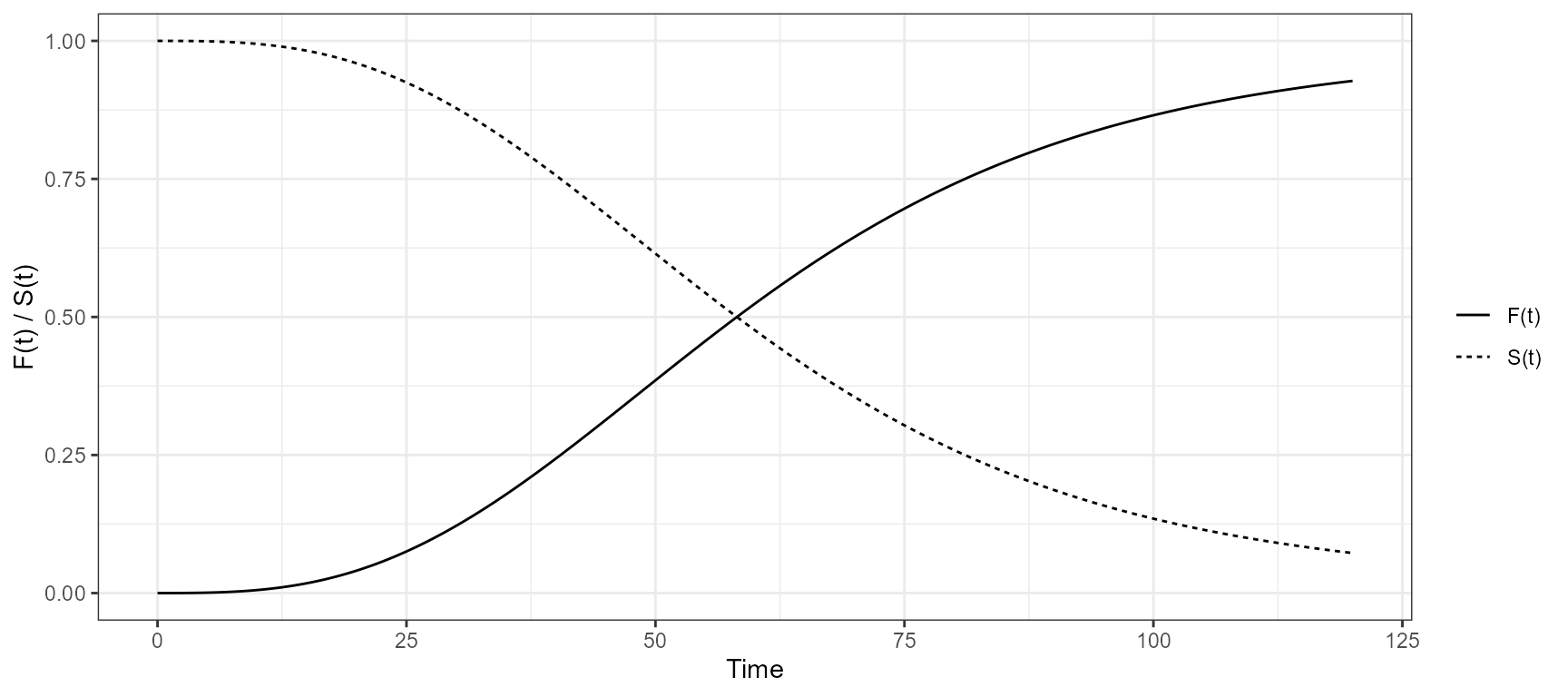
p2 <-
plot_ly(
alldata,
x = ~ Time,
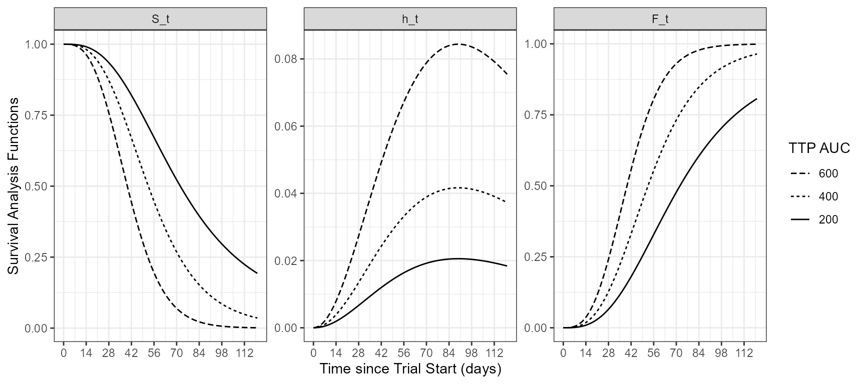
y = ~ Ft,
type = 'scatter',
mode = 'lines',
name = 'F(t)-AUC28',
legendgroup = "F(t)-AUC28",
line = list(color = toRGB("blue", alpha = 0.2), width = 5),
linetype = ~ TRT,
color = I('black'),
hoverinfo = 'text',
text = ~ paste(
"</br> Treatment: ",
TRT,
'</br> Time: ',
round(Time, 1),
'</br> F(t): ',
round(Ft, 1)
)
) %>%
layout(
xaxis = list(
title = 'Days Post Start of Treatment',
ticks = "outside",
autotick = TRUE,
ticklen = 5,
range = c(-2, 121),
gridcolor = toRGB("gray50"),
showline = TRUE
) ,
yaxis = list (
title = 'F(t), Probability' ,
ticks = "outside",
autotick = TRUE,
ticklen = 5,
gridcolor = toRGB("gray50"),
showline = TRUE
) ,
legend = list(
orientation = 'h',
xanchor = "center",
y = -0.25,
x = 0.5
)
)
subplot(p, p2,nrows = 2,shareX = TRUE,shareY = FALSE,titleX = TRUE,titleY = TRUE)
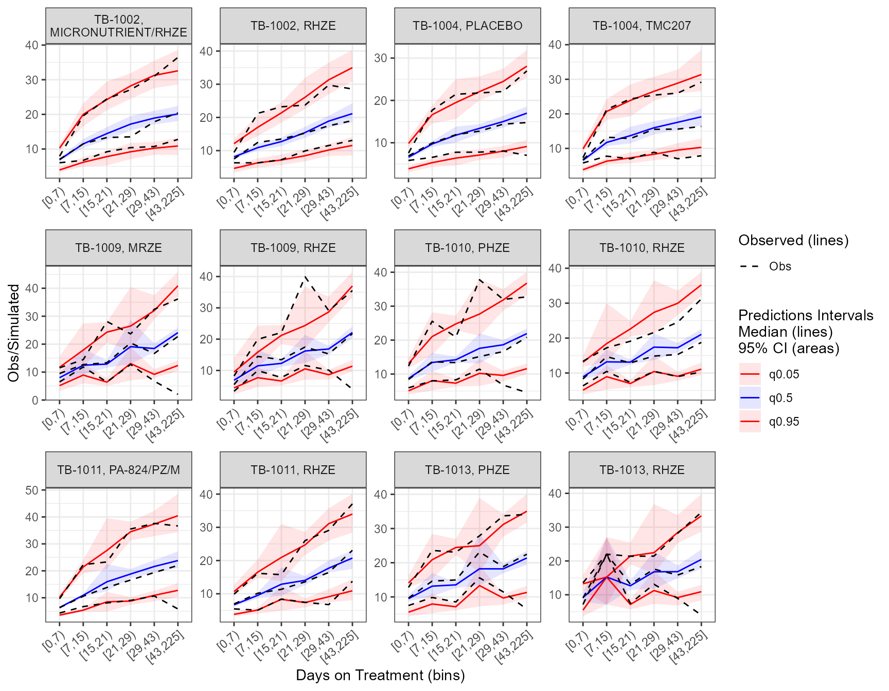
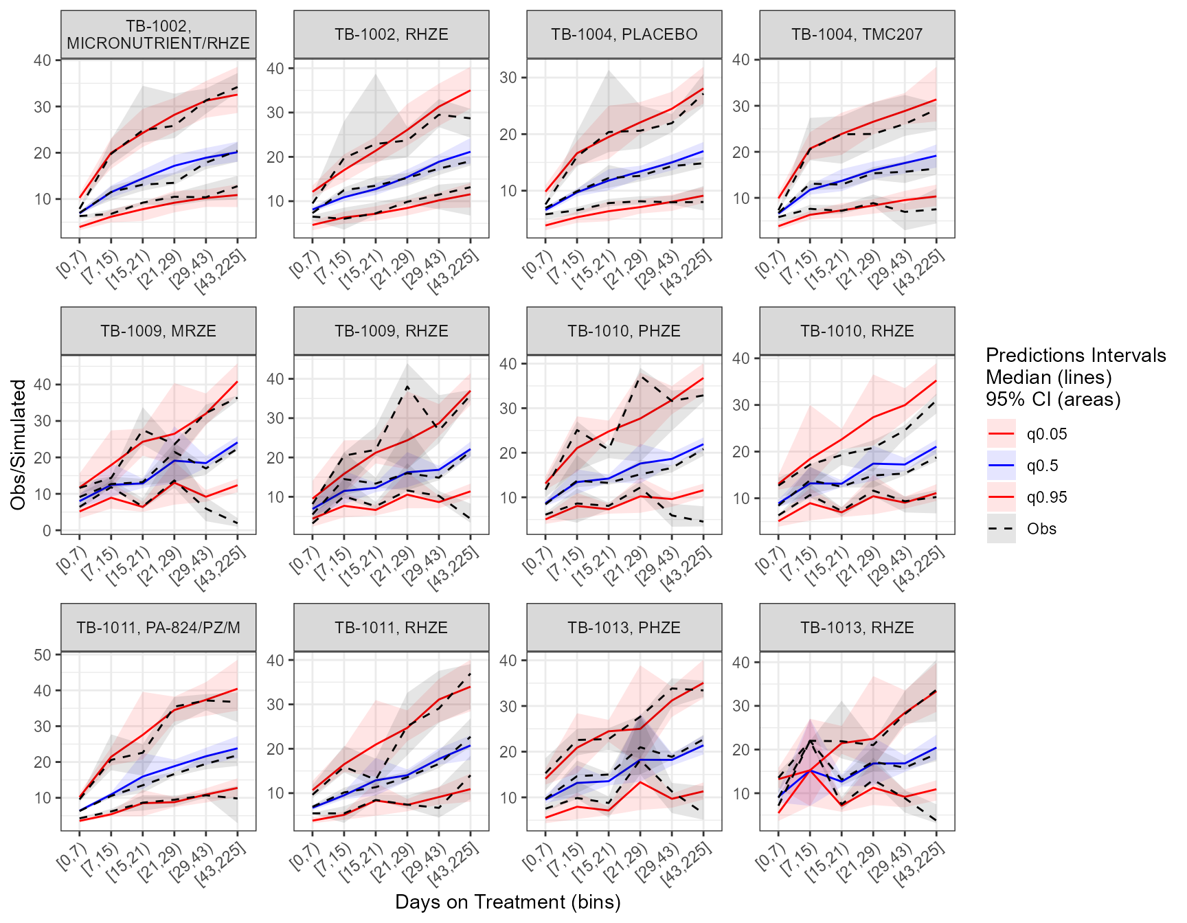
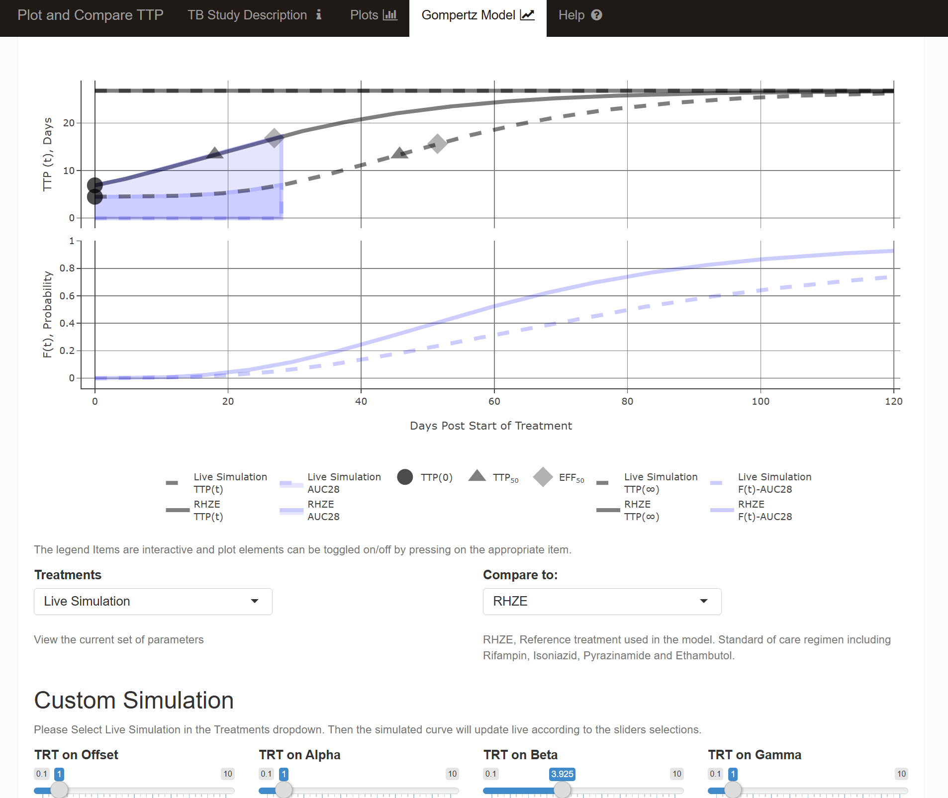
 The app included an interactive