During my journey in pharmacometrics, model-informed drug development and applied data sciences in R, it was rare when I had to produce figures with maps. Yet I love maps, and they can be especially useful to communicate the location of the various clinical trial sites, the places where my students and fellows from the Africa applied pharmacometrics (APT) training program came from, or the distribution of a disease on the globe.
In this post, I will cover some of the maps that I have done, share the code, the thought process, and show how to re-generate using current tools.
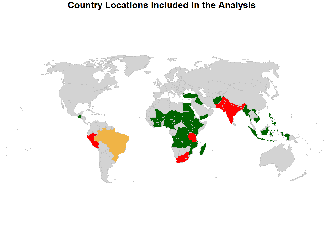
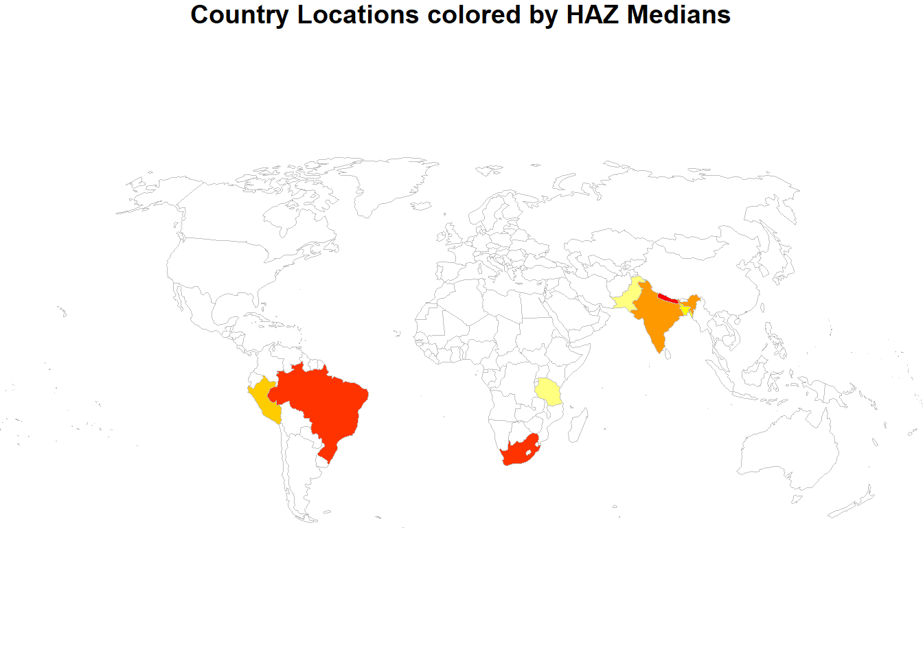
In a previous blog, I referred to my PAGE 2016 poster: Primary Microcephaly: Do All Roads Lead to Rome? which not only had a 3D surface but also a map where the countries that were part of the database were highlighted. I reproduce the poster map and another one colored by country specific height-for-age (HAZ) medians. I read in data, compute stat by country, I join the datasets using joinCountryData2Map matching by ISO2 country codes and use the mapCountryData function and the Winkel Tripel projection:
8 codes from your data successfully matched countries in the map
0 codes from your data failed to match with a country code in the map
     failedCodes failedCountries
235 codes from the map weren't represented in your data
Code
par(mai=c(0,0,0.2,0),xaxs="i",yaxs="i")sPDF <- sPDF[-which(sPDF$ADMIN=="Antarctica"),]sPDF <-spTransform(sPDF, CRS=CRS("+proj=wintri +ellps=WGS84"))sPDF$colCode <-1sPDF$colCode[ which(sPDF$ADMIN %in%c("Brazil"))] <-2sPDF$colCode[ which(sPDF$ADMIN %in%c("Peru","United Republic of Tanzania","South Africa","Bangladesh","India","Nepal","Pakistan"))] <-3sPDF$colCode[ which(sPDF$ADMIN %in%c("Iraq","Turkey", "Yemen","Afghanistan","Cambodia","Indonesia","Myanmar", "Philippines","Vietnam","Guatemala","Chad","Egypt","Sudan","South Sudan","Burkina Faso","Ivory Coast","Ghana","Mali","Niger","Nigeria","Angola","Cameroon","Democratic Republic of the Congo","Burundi","Ethiopia","Kenya","Madagascar","Malawi","Mozambique","Rwanda","Uganda","Zambia"))] <-5#"United States of America","Canada",colourPalette <-c("lightgray","orange","red","orange","darkgreen")mapCountryData( sPDF , nameColumnToPlot="colCode" , mapTitle="Country Locations Included In the Analysis" , colourPalette=colourPalette, catMethod='fixedWidth' , addLegend =FALSE)
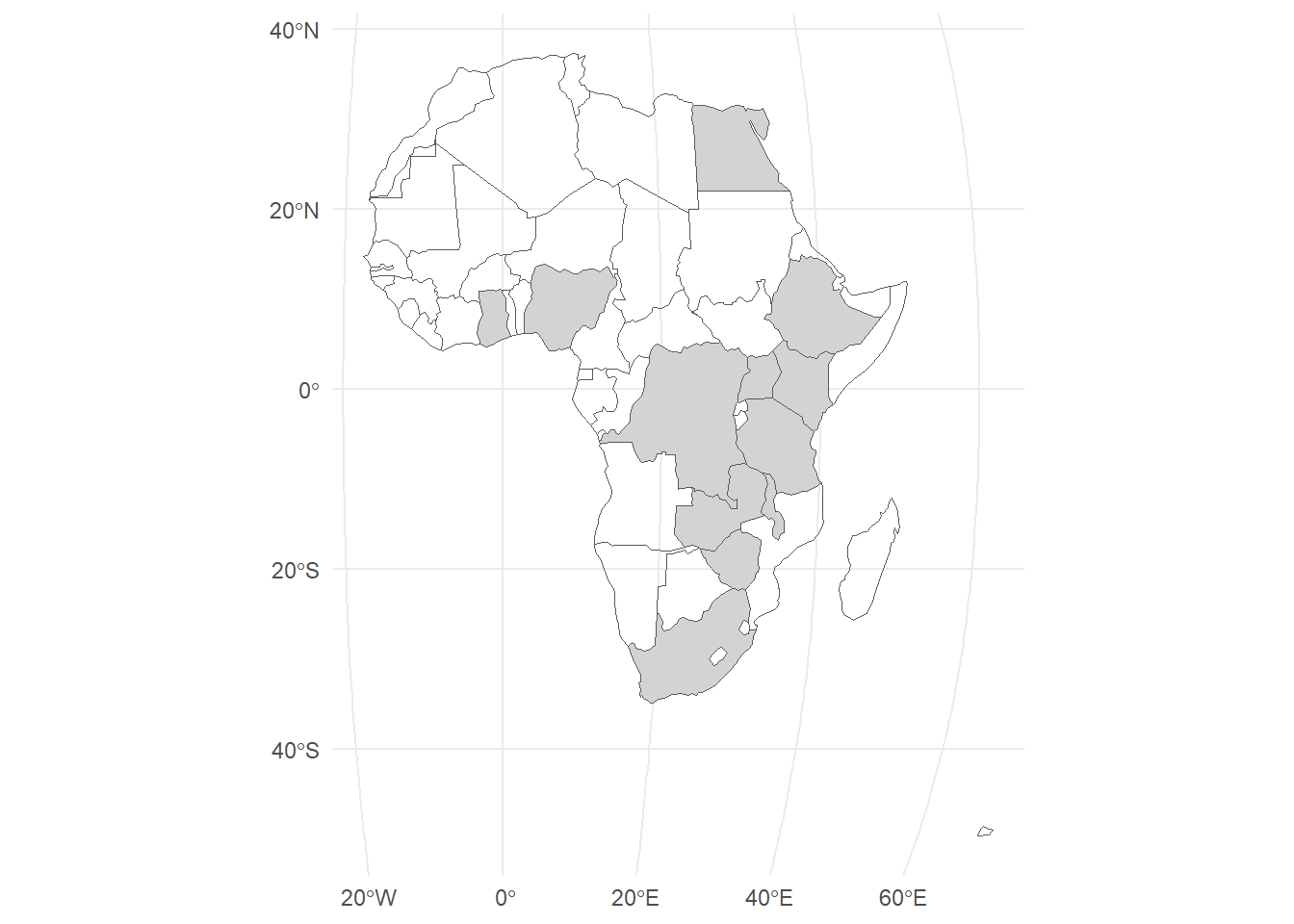
In another PAGE poster, I presented a map focusing on Africa and highlighting the countries of the fellows using ggplot2 and geom_sf with a Robinson Projection:
Code
APT2023 <-read.csv("APT2023.csv" )world_sf <-ne_countries(returnclass ="sf") world_sf <-subset(world_sf, admin !="Antarctica") # we don't rly need Antarcticaworld_sf <-subset(world_sf, region_un =="Africa") # we don't rly need Antarcticaworld_sf$colored <-ifelse(world_sf$name_en %in% APT2023$Country,"APT","")# Robinson projectioncrs_robin <-"+proj=robin +lat_0=0 +lon_0=0 +x0=0 +y0=0"# base plotbase <-ggplot() +geom_sf(data = world_sf, size =0.2,aes(fill=colored),show.legend =FALSE) +scale_fill_manual(values=c("transparent","lightgray"))# worldp1 <- base +theme_minimal() +coord_sf(crs = crs_robin)p1
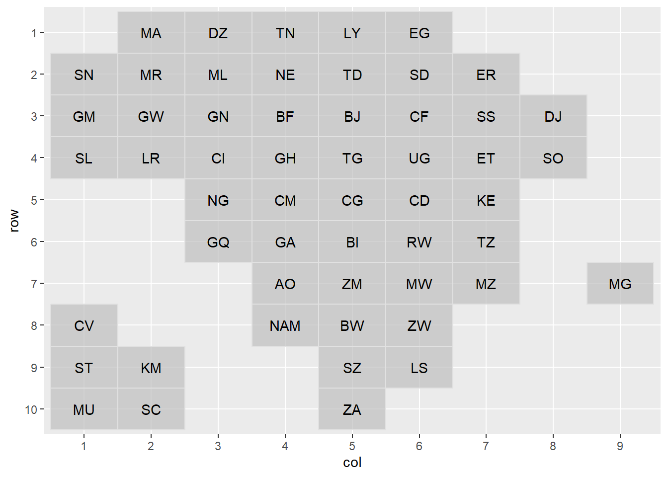
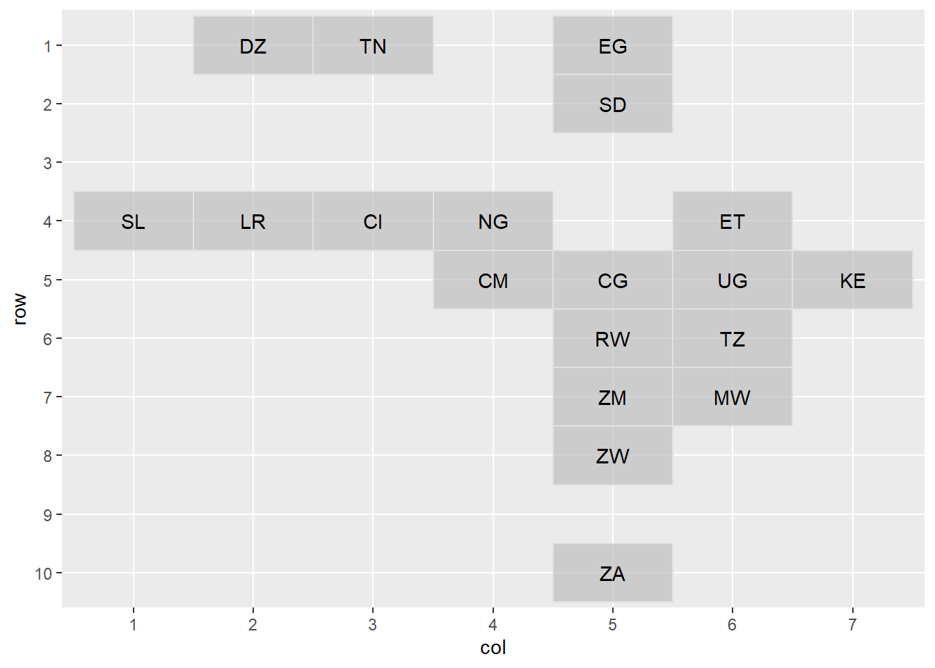
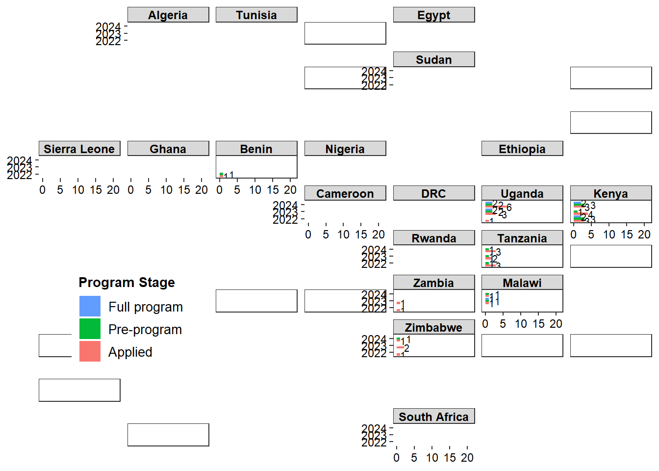
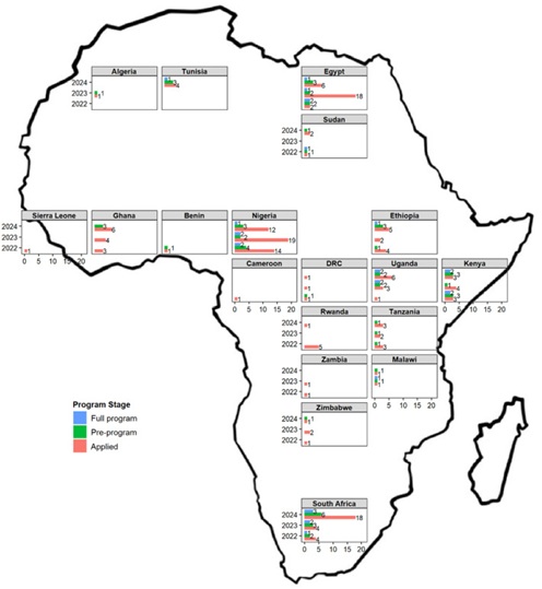
The most recent paper on the same capacity development program Advancing pharmacometrics in Africa-Transition from capacity development toward job creation, had a more elaborate Africa map outline and where used geofacet to show country specific statistics. Unfortunately facet_geo is currently broken and I add another plot that was not in the paper and the Africa map outline which were later combined in PowerPoint.
*Initial geofacet Grid:
Code
library(tidyverse)library(readxl)library(geofacet)library(export)library(sf)library(rnaturalearth)library(rnaturalearthdata)na_function <-function(x) { x[is.na(x)] <-0return(x)}dat <-tibble(Country ="Benin")for (year inc("2022", "2023", "2024")) { datx <-read_excel("APT_Demographics_clean.xlsx", year) %>%filter(`Africa affiliated`=="Yes") %>%select(Country, Preprogram, Full_program) %>%mutate(Country =if_else(str_detect(Country, "Congo"), "Democratic Republic of Congo", Country), Preprogram =if_else(Preprogram =="Yes", 1, 0),Full_program =if_else(Full_program =="Yes", 1, 0)) %>%group_by(Country) %>%summarize(a =length(Country),p =sum(Preprogram),e =sum(Full_program)) y <-colSums(datx[-1])message(paste0("In the year ", year, ", ", y[1], ", ", y[2], ", and ", y[3], " applied, went into the pre-program, and were selected for the full program respectively."))colnames(datx) <-c("Country", paste0(colnames(datx)[-1], year)) dat <-full_join(dat, datx)}dat <- dat %>%mutate_at(vars(a2022:e2024), na_function) %>%pivot_longer(-Country, names_to ="applied", values_to ="value") %>%mutate(status =if_else(str_detect(applied, "a"), "Applied", ""),status =if_else(str_detect(applied, "p"), "Pre-program", status),status =if_else(str_detect(applied, "e"), "Full program", status),applied =gsub("a|e|p", "", applied),Year =parse_number(applied),label =as.character(value),label =if_else(label =="0", "", label)) dat <- dat %>%mutate(Country2 =case_when(Country =="Benin"~"CI", Country =="Cameroon"~"CM", Country =="Democratic Republic of Congo"~"CG", Country =="Egypt"~"EG", Country =="Ethiopia"~"ET", Country =="Ghana"~"LR", Country =="Kenya"~"KE", Country =="Nigeria"~"NG", Country =="Rwanda"~"RW", Country =="Sierra Leone"~"SL", Country =="South Africa"~"ZA", Country =="Sudan"~"SD", Country =="Tanzania"~"TZ", Country =="Uganda"~"UG", Country =="Zambia"~"ZM", Country =="Zimbabwe"~"ZW", Country =="Algeria"~"DZ", Country =="Malawi"~"MW", Country =="Tunisia"~"TN"))dat <- dat %>%mutate(applied2 =factor(applied),value =if_else(value ==0, NA, value), # To stop bars with zero from appearingstatus =factor(status, levels =c("Applied", "Pre-program", "Full program"))) to_add <-" "similar_numbers <- dat %>%select(Country, applied, value, status) %>%pivot_wider(names_from = status, values_from = value) %>%filter(Applied ==`Pre-program`|`Pre-program`==`Full program`)similar_2022 <- similar_numbers %>%filter (applied =="2022") %>%pull(Country) %>%unique()similar_2023 <- similar_numbers %>%filter (applied =="2023") %>%pull(Country) %>%unique()similar_2024 <- similar_numbers %>%filter (applied =="2024") %>%pull(Country) %>%unique()dat <-mutate(dat, label2 =ifelse(status =="Pre-program"& Year ==2022& Country %in% similar_2022, paste0(to_add, label), label),label2 =ifelse(status =="Pre-program"& Year ==2023& Country %in% similar_2023, paste0(to_add, label2), label2),label2 =ifelse(status =="Pre-program"& Year ==2024& Country %in% similar_2024, paste0(to_add, label2), label2),label2 =ifelse(status =="Applied"& Year ==2023& Country =="Uganda", paste0(to_add, label2), label2))grid_preview("africa_countries_grid1")
ggplot(dat, aes(applied2, value, fill = status)) +geom_col(position =position_dodge(width =0.9, preserve="single"), alpha =1) +coord_flip() +theme_bw() +facet_geo(~ Country2, grid = my_grid, label ="name") +geom_text(aes(applied2, value, label = label2), hjust =0, size =2.7, position =position_dodge(width =0.9)) +theme_bw() +theme(axis.text =element_text(size =9, color ="black"),axis.title =element_blank(),legend.title =element_text(size =10, face ="bold"),legend.text =element_text(size =10),strip.text =element_text(size =9, color ="black", face ="bold", margin =margin(0.05,0,0.05,0, "cm")),panel.grid.major =element_blank(), panel.grid.minor =element_blank(),legend.position =c(0.15, 0.3) ) +scale_y_continuous(breaks =seq(from =0, to =20, by =5), limits =c(0, 21)) +guides(fill =guide_legend(reverse =TRUE)) +labs(fill ="Program Stage")
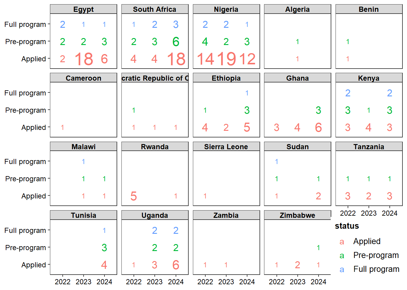
*Alternative geom_text/facet_wrap plot:
Code
ggplot(dat, aes(x=as.factor(Year), status, fill = status)) +geom_text(aes(label=value,size=value,color=status),show.legend =c(size =FALSE, color =TRUE) )+facet_wrap(~reorder(as.factor(Country),value),ncol=5)+scale_size(range =c(3,8))+labs(x="",y="")+theme_bw() +theme(axis.text =element_text(size =9, color ="black"),axis.title =element_blank(),legend.title =element_text(size =10, face ="bold"),legend.text =element_text(size =10),strip.text =element_text(size =9, color ="black", face ="bold", margin =margin(0.05,0,0.05,0, "cm")),panel.grid.major =element_blank(), panel.grid.minor =element_blank(),legend.position ="inside",legend.position.inside =c(0.9, 0.1))+guides(fill =guide_legend(reverse =TRUE))
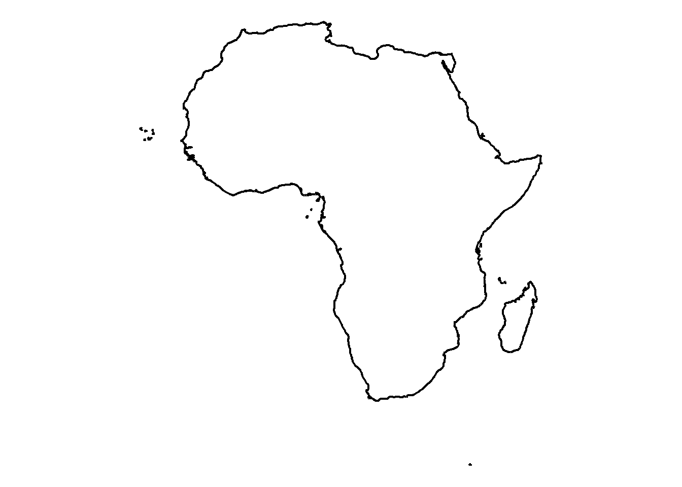
*Africa outline plot:
Code
world <-ne_countries(scale ="medium", returnclass ="sf")africa <- world[world$continent =="Africa", ]africa_boundary <-st_union(africa) # Combine all African countries into a single boundary (dissolve boundaries)afr <-ggplot() +geom_sf(data = africa_boundary, fill =NA, color ="black", linewidth =0.8) +theme_void() afr
For context this was the plot that was included in the paper:
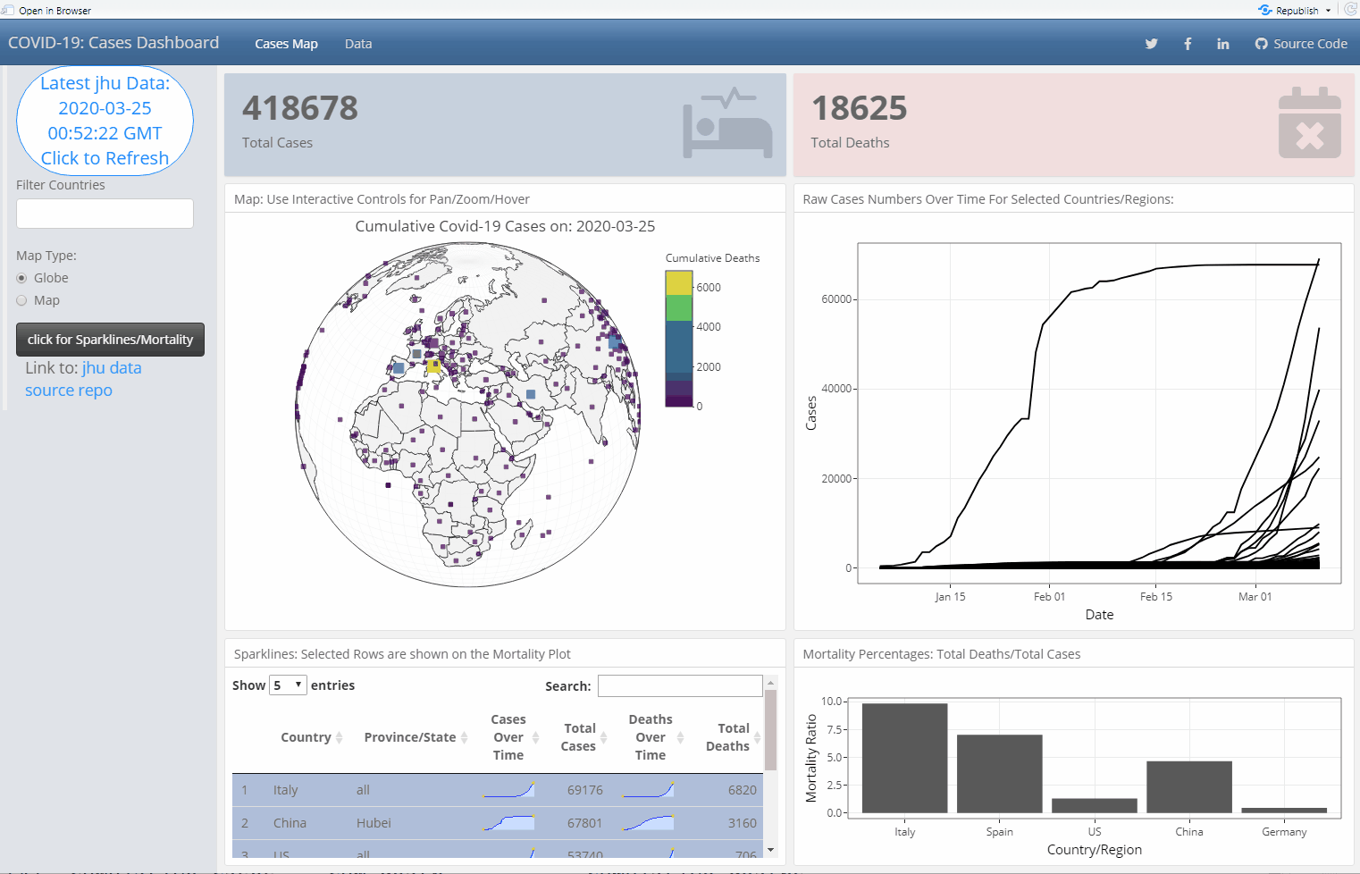
When the COVID-19 pandemic started, there were several live dashboards floating around and I wanted to challenge my dashboarding/R Shiny skills building my own.
This how I produced the plotly 3D globe using the last data snapshot I could find on github:
Have a look at the dashboard source code, if you want to see how cross filtering and interactivity were handled. A gif animation of how this dashboard looked like in 2020 is shown below. It had interactive filters, the map with a 3D/2D projection. Cross-filtering between widgets and sparklines.
The repo lives here but note that some links to publicly available databases at the time might be broken.
In the blog, I have shared my experience with maps, dashboards, interactivity via Shiny, Plotly, htmlwidgets, sparklines and DT interactive tables. Have you used advanced interactivity in your Dashboards? Maps? what is your go to solution/service provider?