Distributions of Exposures

visualization
distributions
Author

Samer Mouksassi

Published

September 1, 2025

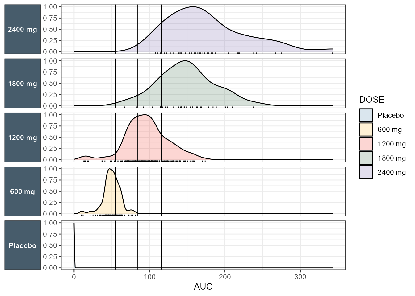
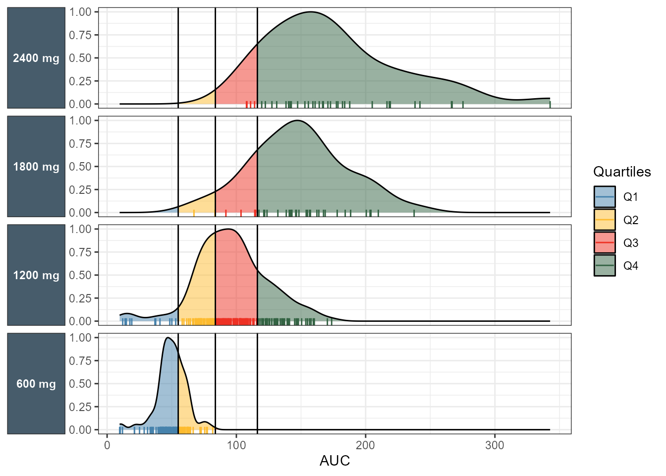
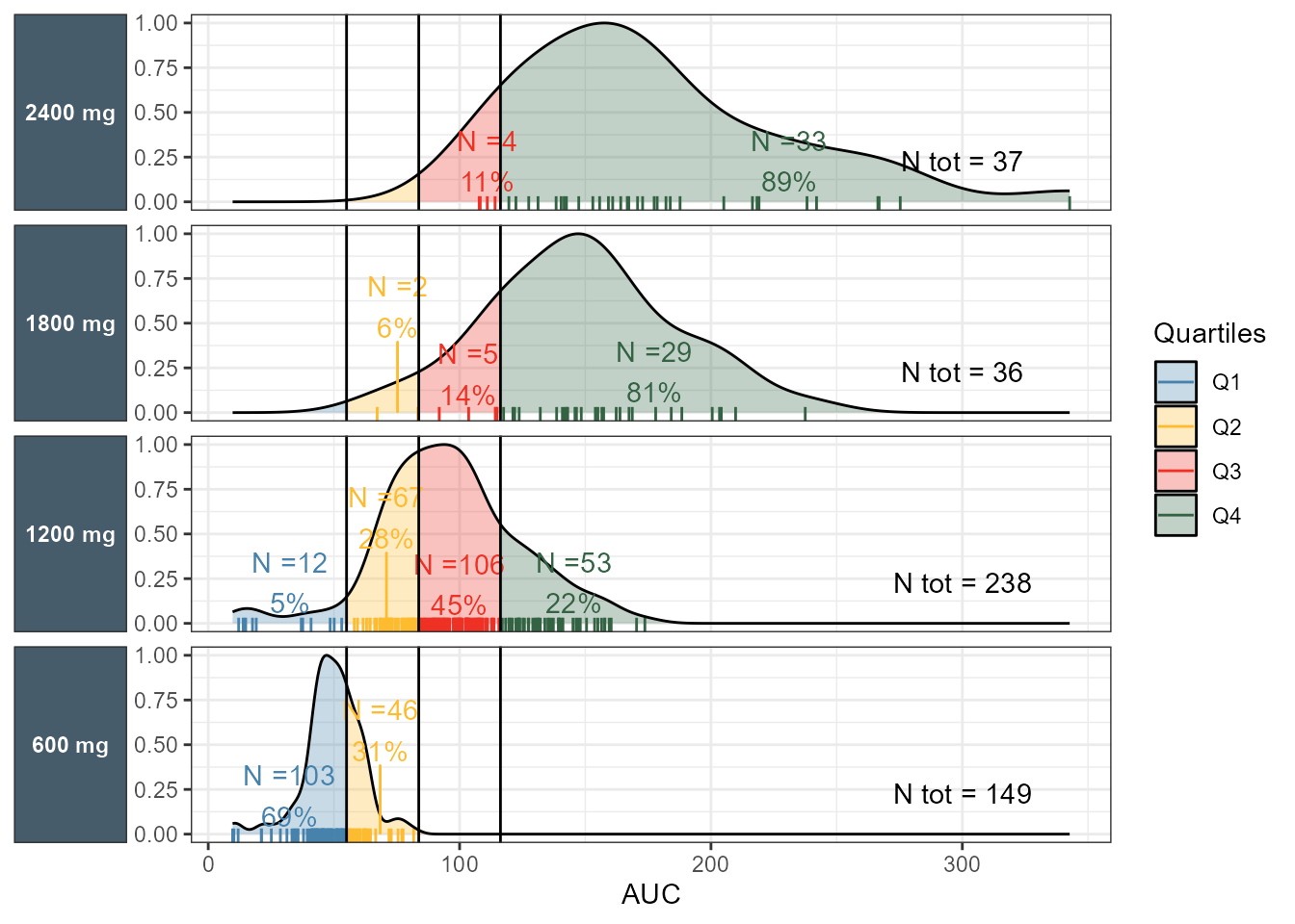
In this post, I will cover visualizing the exposure distributions with more details. The blog post that covered binary response outcomes showed how we often show the distributions of exposures by dose level or study arm, and what interesting summaries we might want to add to it. Keep in mind that we give a dose to a patient and we don’t fully control the resulting exposure. That is because, even when we use the same dose level, different patients would achieve different exposures given that they have different body weights, different metabolism and different physiological characteristics. In today’s post, I will reuse the same binary logistic data and incrementally add info to this plot, each time giving the rationale behind what we are trying to do. First, we compute the quartiles of exposure across all dose levels (without Placebo) and show distribution densities using ggplot2 geom_density, split/facet by Dose colored by Dose and then colored by quartiles. (This feature is supported in ggplot2 > 4.0).

Code
library(ggplot2)
library(tidyr)
library(dplyr)
library(ggquickeda)
library(patchwork)
library(ggridges)
library(ggrepel)
library(ggdist)

ICGI<- read.csv("ICGI.csv")
ICGI$responder <- ifelse(ICGI$ICGI==1,"responder",
                         "not responder")
ICGI$DOSE <- as.factor(ICGI$DOSE)
ICGI$DOSE <- factor(ICGI$DOSE,
                    levels=c("0", "600", "1200","1800","2400"),
                    labels=c("Placebo", "600 mg", "1200 mg","1800 mg","2400 mg"))

AUCquantiles <-   quantile(ICGI$AUC[ICGI$AUC>0],
                           probs = c(0.25,0.5,0.75))
q25 <- AUCquantiles[1]
q50 <- AUCquantiles[2]
q75 <- AUCquantiles[3]

ICGI <- ICGI %>% 
  mutate(AUC_Q = case_when(AUC ==0            ~ "Placebo",
                          AUC <= q25             ~ "Q1",
                          AUC > q25 & AUC <= q50 ~ "Q2",
                          AUC > q50 & AUC <= q75 ~ "Q3",
                          AUC > q75              ~ "Q4"))


ggplot(ICGI ,
       aes(x= AUC))+
  geom_density(aes(y=after_stat(scaled), fill = DOSE),alpha=0.2)+
  geom_rug()+
  geom_vline(xintercept = AUCquantiles)+
  facet_grid(DOSE~.,as.table = FALSE,switch="y")+
  scale_fill_manual(values=c("#4682AC", 
            "#FDBB2F", "#EE3124", "#336343", "#7059a6", "#803333"))+
  scale_color_manual(values=c("#4682AC", 
            "#FDBB2F", "#EE3124", "#336343", "#7059a6", "#803333"))+
  theme_bw()+
  theme(strip.background = element_rect(fill = "#475c6b"),
        strip.text.y.left =   element_text(face = "bold",
                                           color = "white",angle=0),
        strip.placement = "outside", axis.title.y.left = element_blank())

Code
ggplot(ICGI %>% 
         filter(DOSE!="Placebo"))+
  geom_rug(aes(x = AUC,color = AUC_Q ) ,length = unit(0.2,"cm"))+
  geom_density(aes(x = AUC,
                   group = DOSE,
                   y=after_stat(scaled),
                   fill = after_stat(
                     case_when(x <= q25 ~ "Q1",
                               x > q25 & x <= q50 ~ "Q2",
                               x > q50 & x <= q75 ~ "Q3",
                               x > q75 ~ "Q4"))),alpha=0.5)+
  geom_vline(xintercept = c(q25,q50,q75))+
  labs(fill="Quartiles",color="Quartiles")+
  facet_grid(DOSE~.,as.table = FALSE,switch="y")+
  scale_fill_manual(values=c("#4682AC", 
            "#FDBB2F", "#EE3124", "#336343", "#7059a6", "#803333"))+
  scale_color_manual(values=c("#4682AC", 
            "#FDBB2F", "#EE3124", "#336343", "#7059a6", "#803333"))+
  theme_bw()+
  theme(strip.background = element_rect(fill = "#475c6b"),
        strip.text.y.left =   element_text(face = "bold",
                                           color = "white",angle=0),
        strip.placement = "outside", axis.title.y.left = element_blank())

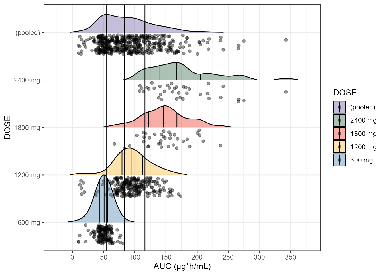
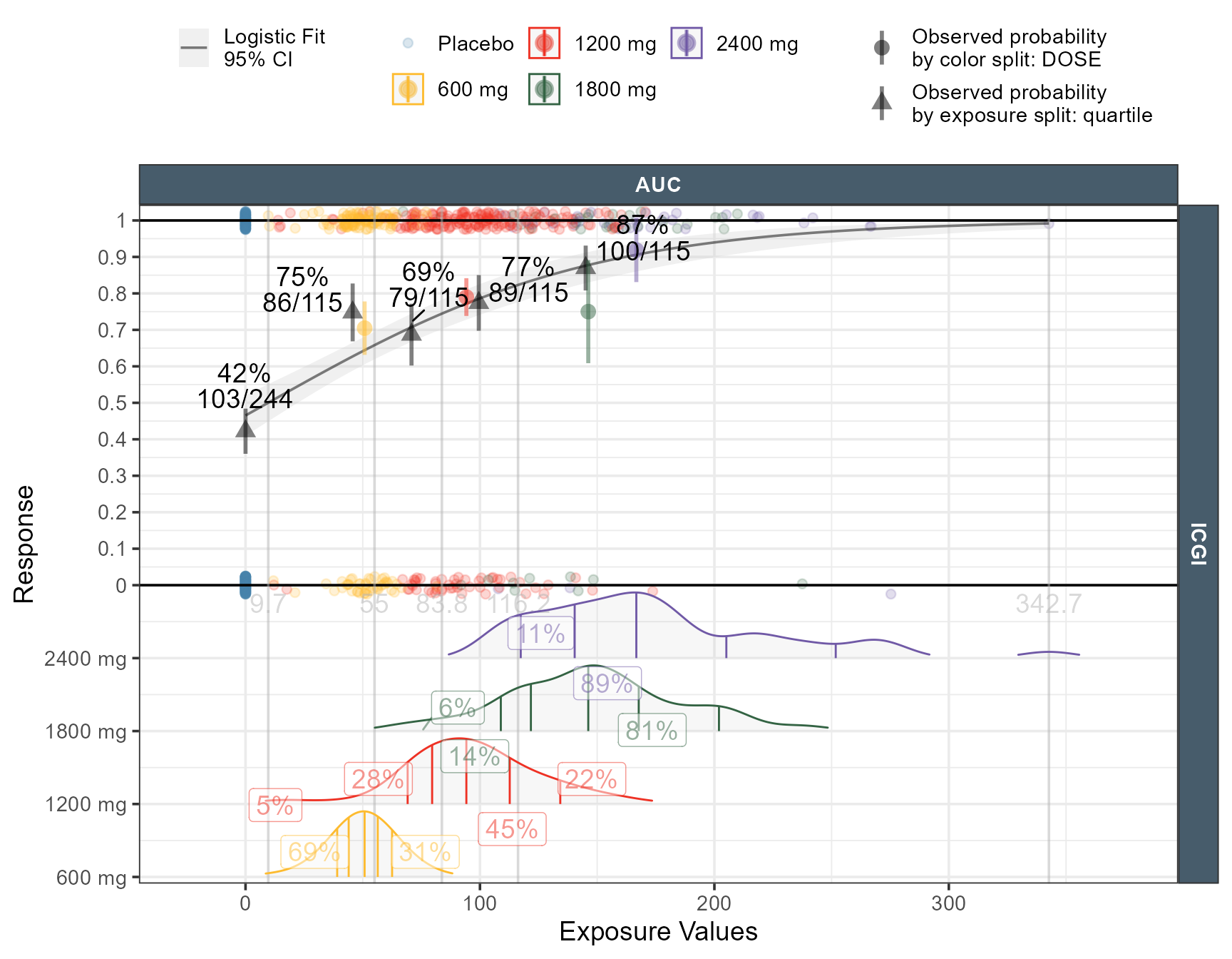
Next, I use ggridges where we put each dose at the y axis and add a “pooled” distribution across all doses (without Placebo). Then I also show the quartiles lines (25%, 50% and 75%) for each dose level and pooled. All values for Placebo are naturally zero and as such I omit the distribution for Placebo. The computed quartiles (which were computed earlier) matches those automatically computed by ggridges.

Code
ggplot(rbind(ICGI %>% 
               filter(AUC>0),
             ICGI %>%
               mutate(DOSE= "(pooled)") %>% 
               filter(AUC>0)),
              aes(x = AUC, y = DOSE, fill = DOSE)) +
  geom_density_ridges(rel_min_height = 0.01,
                      quantile_lines = TRUE,
                      jittered_points = TRUE,
                      position = "raincloud",
                      alpha = 0.4,
                      scale = 1)+
  geom_vline(xintercept = AUCquantiles)+
  guides(fill = guide_legend(reverse = TRUE))+
  scale_x_continuous(breaks= seq(0,400,50))+
  theme_bw()+
  labs(x="AUC (µg*h/mL)",shape ="")+
  scale_fill_manual(values=c("#4682AC", 
            "#FDBB2F", "#EE3124", "#336343", "#7059a6", "#803333"))

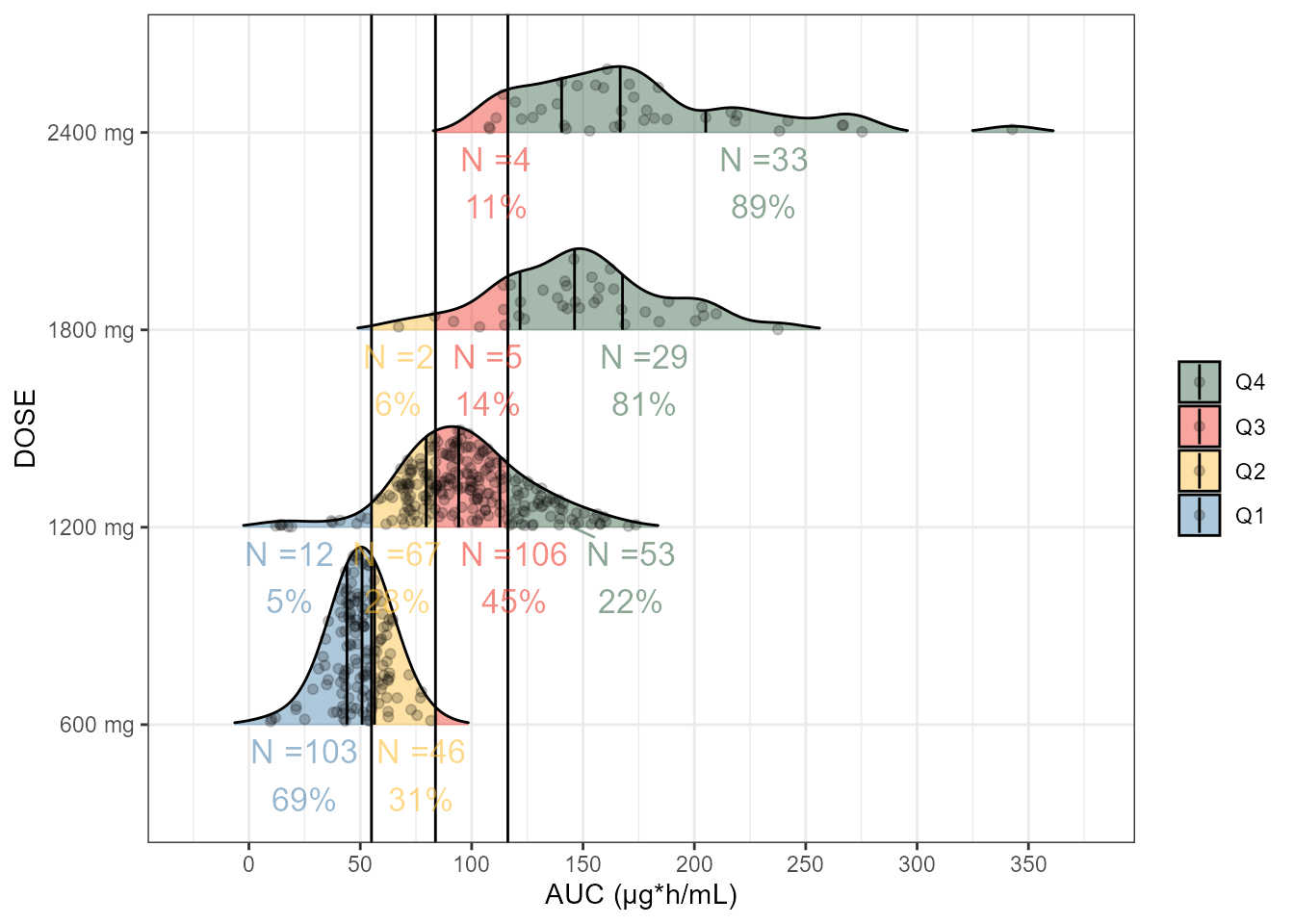
What we want to reason about is how many patients would achieve exposures within quartiles limits at a given dose level ? This would tell us about the probability of achieving exposures below the first quartile (Q1), between Q1 and Q2, between Q2 and Q3 and ≥ Q4. We compute the quantities of interest using table1 as well as using simple counting by Dose and quartile category.

Code
table1::table1(~AUC_Q|DOSE,ICGI,overall = FALSE)
Placebo
(N=244)
600 mg
(N=149)
1200 mg
(N=238)
1800 mg
(N=36)
2400 mg
(N=37)
AUC_Q
Placebo 244 (100%) 0 (0%) 0 (0%) 0 (0%) 0 (0%)
Q1 0 (0%) 103 (69.1%) 12 (5.0%) 0 (0%) 0 (0%)
Q2 0 (0%) 46 (30.9%) 67 (28.2%) 2 (5.6%) 0 (0%)
Q3 0 (0%) 0 (0%) 106 (44.5%) 5 (13.9%) 4 (10.8%)
Q4 0 (0%) 0 (0%) 53 (22.3%) 29 (80.6%) 33 (89.2%)
Code
percentineachbreakcategory <- ICGI %>% 
  group_by(DOSE) %>% 
  mutate(Ntot= n())%>% 
  group_by(DOSE,AUC_Q) %>% 
  mutate(Ncat=n(),
         xmed=median(AUC),xmin = min(AUC),
         xmax = max(AUC), xmean = mean(c(xmin,xmax)))%>% 
  mutate(percentage=Ncat/Ntot)%>% 
  distinct(DOSE,AUC_Q,xmed,xmean, xmin, xmax,Ncat,Ntot,percentage) %>% 
  arrange(DOSE,AUC_Q)

We then add this information to the ggridges plot using geom_density_ridges_gradient to color by quartile and using geom_text to add the percentages. We also show how to do it using geom_density and facet_grid.

Code
ggplot(ICGI %>% filter(AUC>0),
       aes(x = AUC, y = DOSE)) +
  geom_density_ridges_gradient(aes(fill = after_stat(
    case_when(x <= q25 ~ "Q1",
              x > q25 & x <= q50 ~ "Q2",
              x > q50 & x <= q75 ~ "Q3",
              x > q75 ~ "Q4"))),
    rel_min_height = 0.01,
    quantile_lines = TRUE,
    jittered_points = TRUE, alpha = 0.2, scale = 0.9)+
  geom_vline(xintercept = AUCquantiles)+
  geom_text_repel(data=percentineachbreakcategory %>% 
                    filter(DOSE!="Placebo"),
                  aes(label=paste0("N =",Ncat,"\n",round(100*percentage,0),"%"),
                      x=xmean, y =DOSE,size=4,
                      color = AUC_Q ),vjust=1.2,
            direction="x",show.legend = FALSE)+
  guides(fill = guide_legend(reverse = TRUE))+
  scale_x_continuous(breaks= seq(0,400,50))+
  theme_bw()+
  labs(x="AUC (µg*h/mL)",fill ="")+
  scale_fill_manual(values=c("#4682AC70", "#FDBB2F70", "#EE312470",
                             "#33634370", "#7059a670", "#80333370"))+
  scale_color_manual(values=c("#4682AC90", "#FDBB2F90", "#EE312490",
                             "#33634390", "#7059a690", "#80333390"))

Code
ggplot(ICGI %>% 
         filter(DOSE!="Placebo"))+
  geom_rug(aes(x = AUC,color = AUC_Q ) ,length = unit(0.2,"cm"))+
  geom_density(aes(x = AUC,
                   group = DOSE,
                   y=after_stat(scaled),
                   fill = after_stat(
                     case_when(x <= q25 ~ "Q1",
                               x > q25 & x <= q50 ~ "Q2",
                               x > q50 & x <= q75 ~ "Q3",
                               x > q75 ~ "Q4"))),alpha=0.3)+
  geom_text_repel(data=percentineachbreakcategory %>% 
                    filter(DOSE!="Placebo"),
                  aes(label=paste0("N =",Ncat,"\n",round(100*percentage,0),"%"),
                      x=xmean, y =0,
                      color = AUC_Q ),direction="y",
                  show.legend = FALSE)+
  geom_text(data=percentineachbreakcategory %>% 
              filter(DOSE!="Placebo")%>%
              ungroup() %>%
              distinct(DOSE,Ntot),
            aes(label=paste0("N tot = ",Ntot,"\n\n"),
                x=300,y=0,
            ))+
  geom_vline(xintercept = c(q25,q50,q75))+
  labs(fill="Quartiles",color="Quartiles")+
  facet_grid(DOSE~.,as.table = FALSE,switch="y")+
  scale_fill_manual(values=c("#4682AC", 
                             "#FDBB2F", "#EE3124", "#336343", "#7059a6", "#803333"))+
  scale_color_manual(values=c("#4682AC", 
                              "#FDBB2F", "#EE3124", "#336343", "#7059a6", "#803333"))+
  theme_bw()+
  theme(strip.background = element_rect(fill = "#475c6b"),
        strip.text.y.left =   element_text(face = "bold",
                                           color = "white",angle=0),
        strip.placement = "outside", axis.title.y.left = element_blank())

The plot above show us the N of patients and percentages by quartile at each dose level. At the 1800 mg dose, 81 % of patients were at the highest quartile versus 89% at the 2400 mg. We can appreciate that there is some saturation going on. For reference I will show again a plot done using ggresponseexpdist which automates this process when user specify the exposure_distribution_percent option.

Code
ICGIERDATA <- ICGI
ICGIERDATA$Endpoint <- "ICGI"
ICGIERDATA$response <- ICGIERDATA$ICGI 

ggresponseexpdist(data = ICGIERDATA,
model_type = "logistic",
exposure_metrics = c("AUC"),
exposure_metric_split = "quartile",
N_byexptile_ypos = "with means",
mean_obs_bydose = TRUE,
mean_obs_bydose_plac = FALSE,
N_bydose_ypos = "none",
mean_obs_bydose_text_size = 0,
N_text_size = 3,
exposure_distribution_percent = "%")