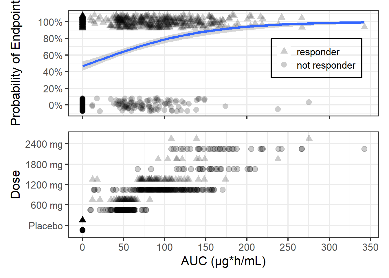
In this post I will provide the code and thinking process behind the figure shared in my first blog post. We will start with a simpler version where we show the Endpoint versus exposures, which in this case are areas under the drug concentrations curves (AUC) on top. And at the bottom, the individual AUCs by dose level with a different symbol by responder status: responder (as triangles) and not responder (as circles).
With this visual representation several questions remain without an answer:
What is the probability of response by dose level?
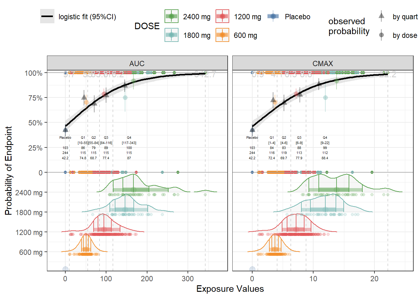
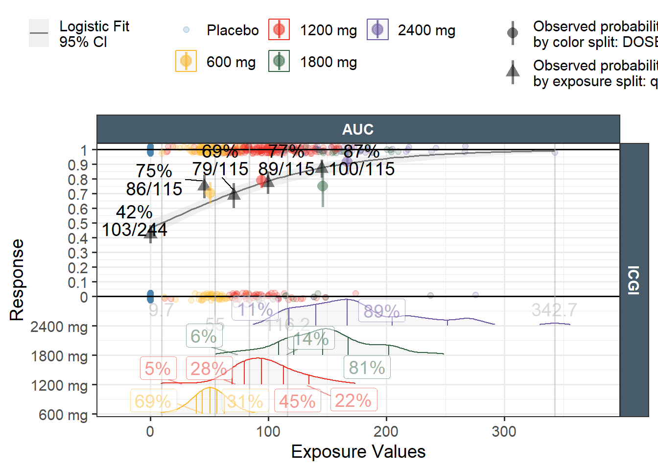
What is the probability of response by tertiles or quartiles of exposures ? and how about the Placebo (exposure = 0) response?
We will answer these questions incrementally. First we reshape the data into long format to accomodate the possibility of multiple endpoints and multiple exposure metrics. Second we compute the quartiles of exposures by exposure metric and endpoint, keeping the Placebo separate. Then we add the variable exptile that will assign to each exposure one of the following values: “Placebo”, “Q1”, “Q2”, “Q3”, “Q4”. We also compute the exposure limits that can be used in the graph to show the limits of each quartile.
Code
exposure_metric_plac_value <-0# compute quantiles and assign each exposure to its corresponding exptileICGIlong <- ICGI %>%gather(Endpoint,response,ICGI) %>%# can handle multiple endpoints at the same time gather(expname,expvalue,AUC,CMAX) %>%# can handle multiple exposures at the same timegroup_by(Endpoint,expname) %>%mutate( Q25 =quantile(expvalue[!expvalue %in%c(exposure_metric_plac_value)], 0.25, na.rm =TRUE), Q50 =quantile(expvalue[!expvalue %in%c(exposure_metric_plac_value)], 0.50, na.rm =TRUE), Q75 =quantile(expvalue[!expvalue %in%c(exposure_metric_plac_value)], 0.75, na.rm =TRUE), exptile =case_when(expvalue == exposure_metric_plac_value ~"Placebo", expvalue > exposure_metric_plac_value & expvalue <= Q25~"Q1", expvalue > Q25 & expvalue <= Q50 ~"Q2", expvalue > Q50 & expvalue <= Q75 ~"Q3", expvalue > Q75 ~"Q4"))exposurelimits <- ICGIlong %>%group_by(expname, Endpoint)%>%reframe(intercept =quantile(expvalue[!expvalue %in%c( exposure_metric_plac_value)], c(0, 0.25, 0.5, 0.75, 1), na.rm =TRUE),quant =c(0,0.25, 0.5, 0.75, 1))
We prepare the distributions plot beneath the probability of response curve by using ggridges, constructing a numrical value for where to plot the distributions and by excluding the Placebo from the distributions plot. The distributions are shown as densities scaled to 1 with quantiles lines at 10th, 25th 50th, 75th and 90th percentiles.
Code
#these values will become an argument in the ER function dist_position_scaler =0.2 dist_offset =0 dist_scale =0.9ICGIlong$keynumeric <--dist_position_scaler *as.numeric( forcats::fct_rev(as.factor(dplyr::pull(ICGIlong[,"DOSE"])))) + dist_offsetp1 <-ggplot(ICGIlong, aes(expvalue,response) )+geom_point(aes(col=DOSE))+geom_hline(yintercept=c(0,1),col="darkgray")+geom_vline(data=exposurelimits,aes(xintercept = intercept),col="lightgray",linetype="dashed")+geom_text(data=exposurelimits,aes(x = intercept,y=Inf,label=round(intercept,1)),col="lightgray",vjust=1)+geom_smooth(method="glm",method.args =list(family ="binomial"),color="black",aes(fill="logistic fit (95%CI)"))+geom_density_ridges(data=ICGIlong %>%filter(DOSE!="Placebo"),aes(expvalue,y=keynumeric,group=DOSE,col=DOSE,height =after_stat(ndensity)),rel_min_height =0.005,alpha=0.1,scale = dist_scale,quantile_lines =TRUE, quantiles =c(0.1,0.25, 0.5, 0.75,0.9))+geom_point(data=ICGIlong%>%filter(DOSE!="Placebo"), aes(expvalue,y=keynumeric-0.025,col=DOSE),alpha =0.2)+facet_grid(~expname,scales="free_x")+ ggthemes::scale_color_tableau()+scale_fill_manual(values="gray")+labs(fill="")+theme_bw()+theme(legend.position ="top")+guides(fill =guide_legend(order =1),color =guide_legend(order =2, nrow=2, reverse =TRUE))
Next we compute the probabilities of response by exposures quartiles and by dose levels and add it to the plot using geom_pointrange
Finally we want to annotate the plot by displaying for each exptile the bin limits, the total N of subjects, the N of responders the probability of response.
In the ggquickeda package the ggresponseexpdist function automate a lot of these operations to be able to generate these advanced plots using concise syntax.