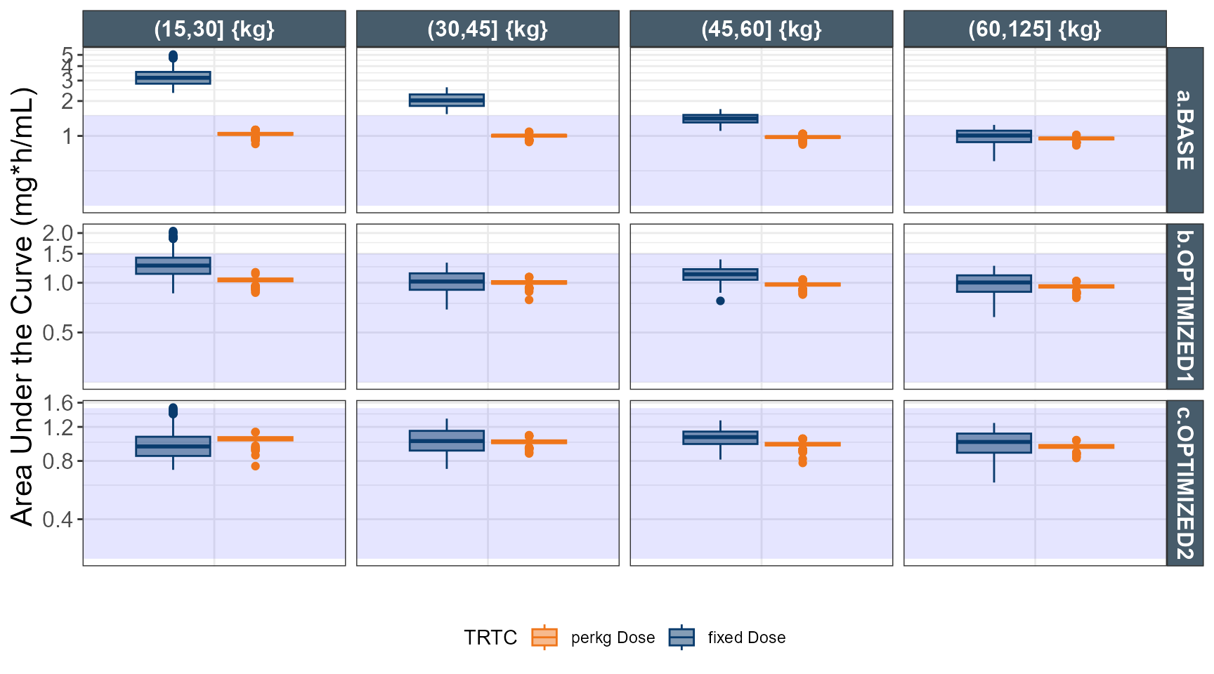
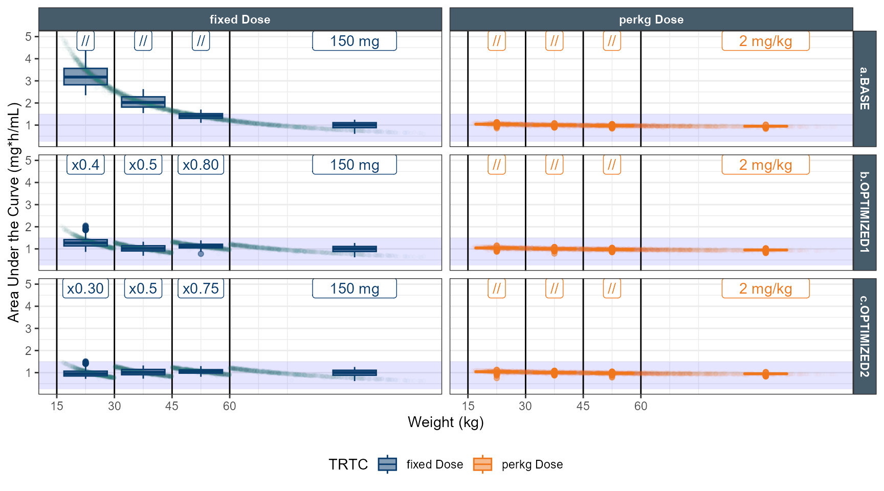
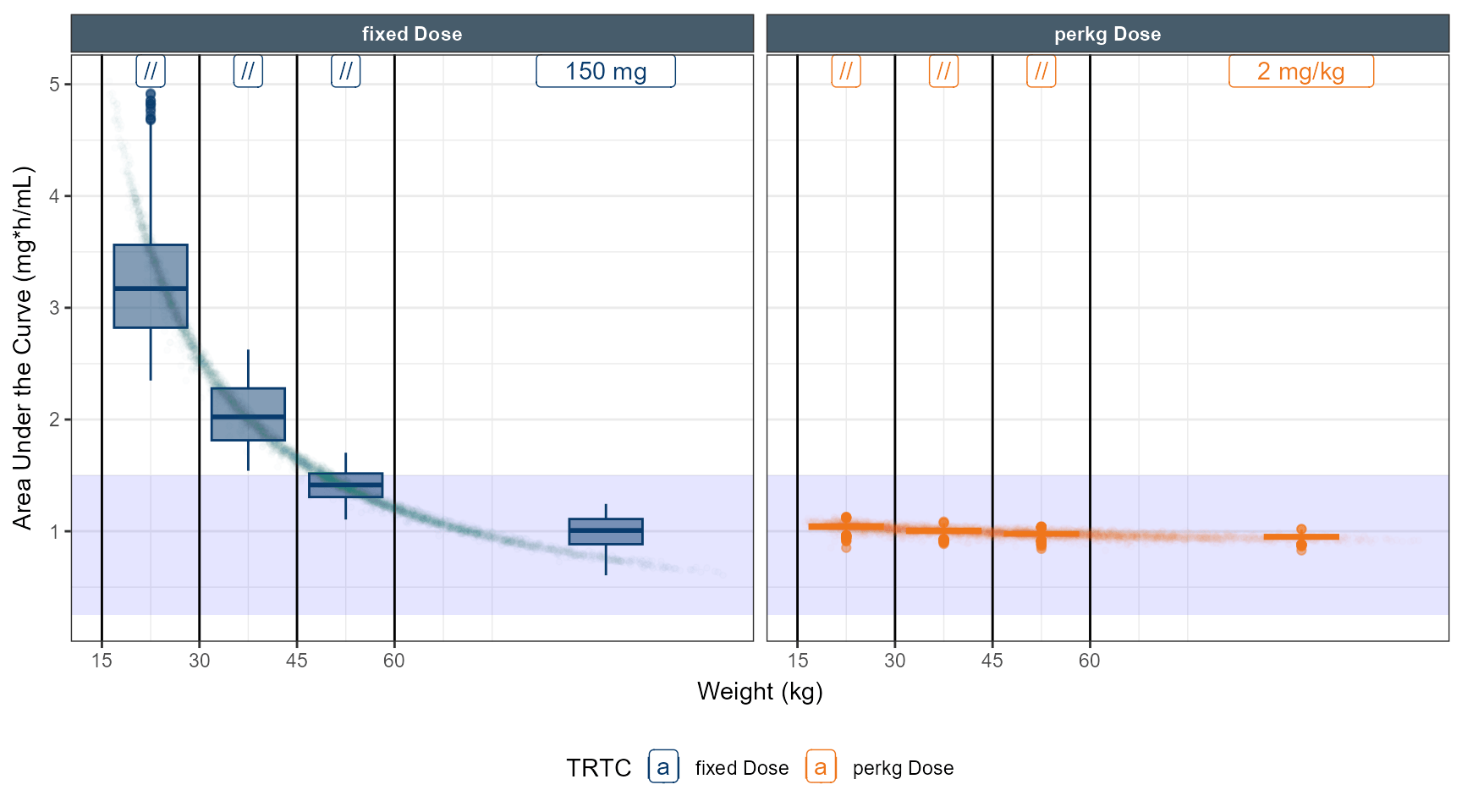
# simulate dose strategy 1 80 % 50 % 40 %
ev1 <- ev(time=0,amt=150, cmt=1)
data.dose <- ev(ev1)
data.dose<-as.data.frame(data.dose)
data.all<-merge(idata,data.dose)
data.all$amt<- ifelse( data.all$TRT==1,150,2*round(data.all$WT,0))
data.all$amt<- ifelse( data.all$TRT==1&data.all$WT<60 ,150*0.8,data.all$amt)
data.all$amt<- ifelse( data.all$TRT==1&data.all$WT<45 ,150*0.5,data.all$amt)
data.all$amt<- ifelse( data.all$TRT==1&data.all$WT<30 ,150*0.4,data.all$amt)
outpedsim<-modcovpedsim %>%
data_set(data.all) %>%
carry.out(TRT,WT,AGE,SEX,CLi) %>%
mrgsim(end=24, delta=1)
outpedsim<-as.data.frame(outpedsim)
outpedsim <- outpedsim %>%
arrange(ID,time,WT)
out.ped.nca.1 <- outpedsim %>%
group_by(ID,TRT,SEX,WT,AGE)%>%
summarise (Cmax = max(CP,na.rm = TRUE),
Clast= CP[n()],
AUC= sum(diff(time ) *na.omit(lead(CP) + CP)) / 2,
CLi= median(CLi))
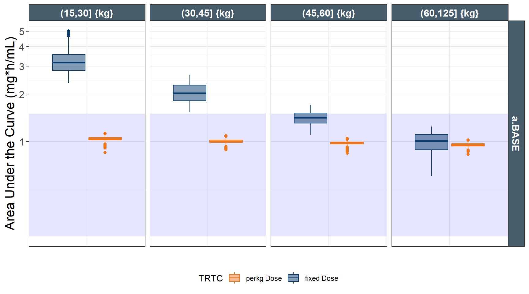
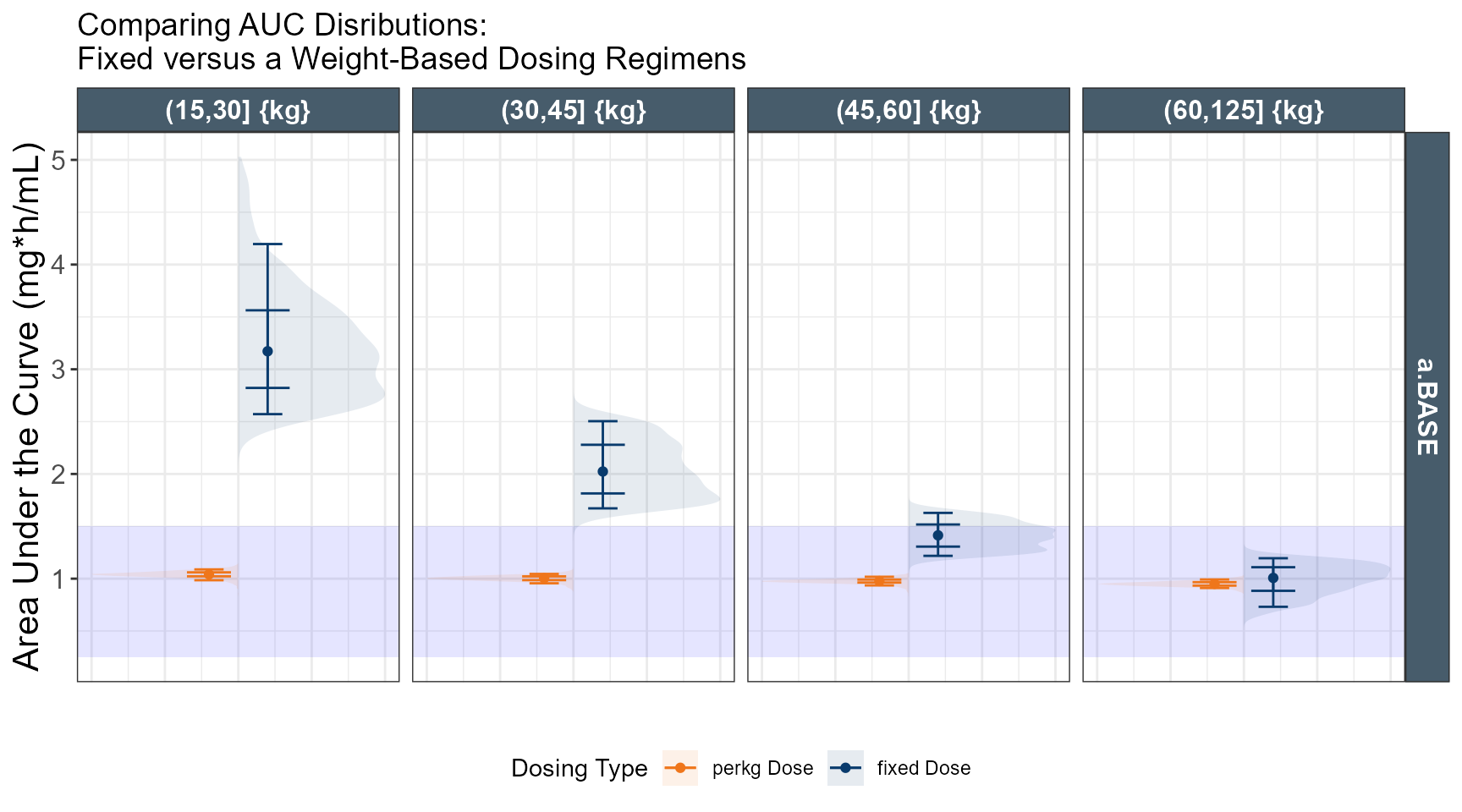
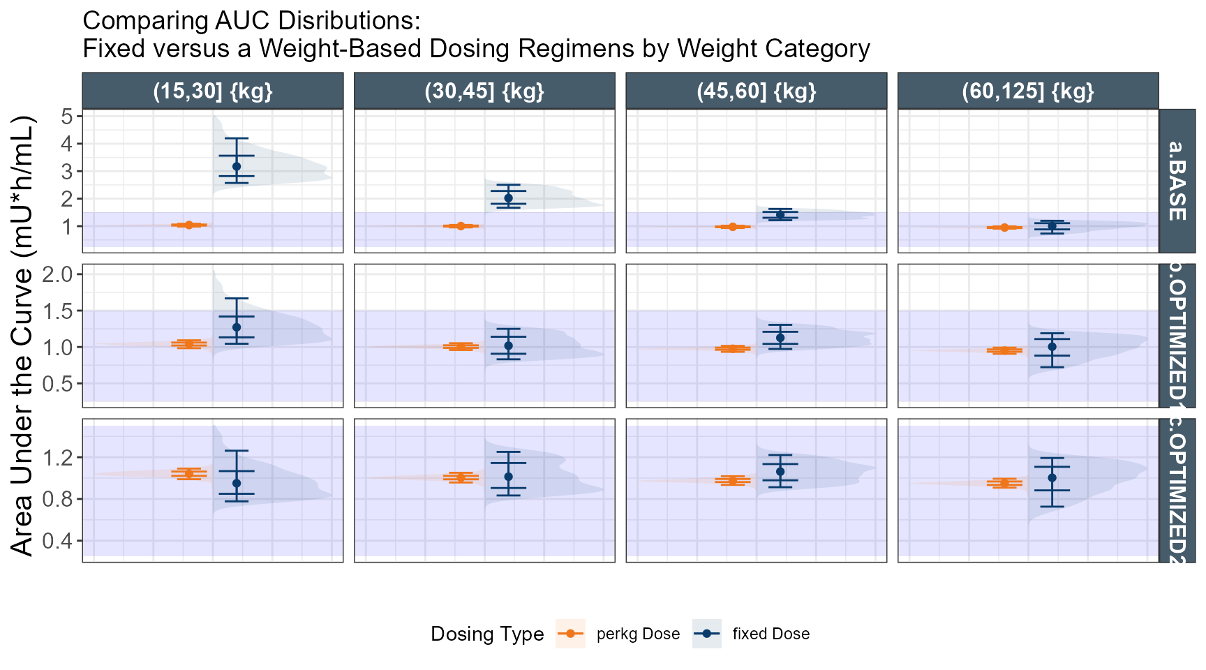
out.ped.nca.1$TRTC <- ifelse(out.ped.nca.1$TRT==1,"fixed Dose","perkg Dose")
out.ped.nca.1$WTC <- cut(out.ped.nca.1$WT,breaks = c(15,30,45,60,125))
out.ped.nca.1$`Weight Category` <- factor.with.units(out.ped.nca.1$WTC, "{kg}")
# simulate dose strategy 2 75 % 50 % 30 %
ev1 <- ev(time=0,amt=150, cmt=1)
data.dose <- ev(ev1)
data.dose<-as.data.frame(data.dose)
data.all<-merge(idata,data.dose)
data.all$amt<- ifelse( data.all$TRT==1,150,2*round(data.all$WT,0))
data.all$amt<- ifelse( data.all$TRT==1&data.all$WT<60 ,150*0.75,data.all$amt)
data.all$amt<- ifelse( data.all$TRT==1&data.all$WT<45 ,150*0.5,data.all$amt)
data.all$amt<- ifelse( data.all$TRT==1&data.all$WT<30 ,150*0.30,data.all$amt)
outpedsim<-modcovpedsim %>%
data_set(data.all) %>%
carry.out(TRT,WT,AGE,SEX,CLi) %>%
mrgsim(end=24, delta=1)
outpedsim<-as.data.frame(outpedsim)
outpedsim <- outpedsim %>%
arrange(ID,time,WT)
out.ped.nca.2 <- outpedsim %>%
group_by(ID,TRT,SEX,WT,AGE)%>%
summarise (Cmax = max(CP,na.rm = TRUE),
Clast= CP[n()],
AUC= sum(diff(time ) *na.omit(lead(CP) + CP)) / 2,
CLi= median(CLi))
out.ped.nca.2$TRTC <- ifelse(out.ped.nca.2$TRT==1,"fixed Dose","perkg Dose")
out.ped.nca.2$WTC <- cut(out.ped.nca.2$WT,breaks = c(15,30,45,60,125))
out.ped.nca.2$`Weight Category` <- factor.with.units(out.ped.nca.2$WTC, "{kg}")
statsdata1 <- out.ped.nca.1 %>%
group_by(TRTC ,WTC,`Weight Category` ) %>%
dplyr::summarize(
low=quantile(AUC, probs = c(0.05) ),
quart=quantile(AUC, probs = c(0.25) ),
med=quantile(AUC, probs = c(0.5) ),
seven=quantile(AUC, probs = c(0.75) ),
up=quantile(AUC, probs = c(0.95) )
)
statsdata2 <- out.ped.nca.2 %>%
group_by(TRTC ,WTC,`Weight Category` ) %>%
dplyr::summarize(
low=quantile(AUC, probs = c(0.05) ),
quart=quantile(AUC, probs = c(0.25) ),
med=quantile(AUC, probs = c(0.5) ),
seven=quantile(AUC, probs = c(0.75) ),
up=quantile(AUC, probs = c(0.95) )
)
statsdata1$REGIMEN <-"b.OPTIMIZED1"
statsdata2$REGIMEN <-"c.OPTIMIZED2"
statsdata1all <-rbind(statsdata,statsdata1,statsdata2)
out.ped.nca$REGIMEN <- "a.BASE"
out.ped.nca.1$REGIMEN <-"b.OPTIMIZED1"
out.ped.nca.2$REGIMEN <-"c.OPTIMIZED2"
out.ped.nca$WTX <- ifelse(out.ped.nca$`Weight Category`=="(15,30] {kg}",(15+30)/2,NA)
out.ped.nca$WTX <- ifelse(out.ped.nca$`Weight Category`=="(30,45] {kg}",(45+30)/2,out.ped.nca$WTX)
out.ped.nca$WTX <- ifelse(out.ped.nca$`Weight Category`=="(45,60] {kg}",(45+60)/2,out.ped.nca$WTX)
out.ped.nca$WTX <- ifelse(out.ped.nca$`Weight Category`=="(60,125] {kg}",(60+125)/2,out.ped.nca$WTX)
out.ped.nca.2$WTX <- ifelse(out.ped.nca.2$`Weight Category`=="(15,30] {kg}",(15+30)/2,NA)
out.ped.nca.2$WTX <- ifelse(out.ped.nca.2$`Weight Category`=="(30,45] {kg}",(45+30)/2,out.ped.nca.2$WTX)
out.ped.nca.2$WTX <- ifelse(out.ped.nca.2$`Weight Category`=="(45,60] {kg}",(45+60)/2,out.ped.nca.2$WTX)
out.ped.nca.2$WTX <- ifelse(out.ped.nca.2$`Weight Category`=="(60,125] {kg}",(60+125)/2,out.ped.nca.2$WTX)
out.ped.nca.1$WTX <- ifelse(out.ped.nca.1$`Weight Category`=="(15,30] {kg}",(15+30)/2,NA)
out.ped.nca.1$WTX <- ifelse(out.ped.nca.1$`Weight Category`=="(30,45] {kg}",(45+30)/2,out.ped.nca.1$WTX)
out.ped.nca.1$WTX <- ifelse(out.ped.nca.1$`Weight Category`=="(45,60] {kg}",(45+60)/2,out.ped.nca.1$WTX)
out.ped.nca.1$WTX <- ifelse(out.ped.nca.1$`Weight Category`=="(60,125] {kg}",(60+125)/2,out.ped.nca.1$WTX)
out.ped.nca.all <-rbind(out.ped.nca,out.ped.nca.1,out.ped.nca.2)
ggplot(out.ped.nca.all, aes(x=`Weight Category`, AUC))+
annotate(geom="rect",xmin=-Inf,xmax=Inf,ymin=0.25,ymax=1.5,alpha=0.1,fill="blue")+
geom_boxplot(aes(fill=TRTC,color = TRTC))+
facet_grid(REGIMEN~`Weight Category`,
labeller = labeller(`Weight Category`= label_value,
REGIMEN = label_value),scales="free")+
theme_bw()+
theme(axis.text.x = element_blank(),legend.position="bottom",
axis.ticks.x=element_blank(),
strip.text=element_text(size=12),
plot.title = element_text(size=14),
axis.text.y=element_text(size=12),axis.title.y = element_text(size=16))+
guides(color=guide_legend(reverse=TRUE),fill=guide_legend(reverse=TRUE))+
theme(strip.background = ggplot2::element_rect(fill = "#475c6b"),
strip.text = ggplot2::element_text(face = "bold",
color = "white"))+
scale_color_manual(values=c("#093B6D", "#EF761B"))+
scale_fill_manual(values=alpha(c("#093B6D", "#EF761B"),0.5)) +
labs(y="Area Under the Curve (mg*h/mL)",x="")+
coord_trans(y = "log")+
guides(color=guide_legend(reverse=TRUE),
fill=guide_legend(reverse=TRUE))