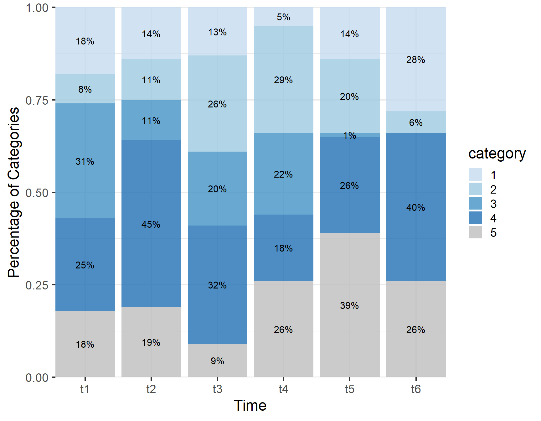
In this post, I will cover visualizing longitudinal categorical data over time. I will start using a stacked barplot with percentages by category labels.
Code
library (ggplot2)library (tidyr)library (dplyr)library (patchwork)library (ggrepel)library (ggh4x)library (ggalluvial)library (scales)library (farver)<- read.csv ("example.csv" )$ category <- as.factor (example$ category)ggplot (example, aes (x = time,fill= category,color= category)) + geom_bar (alpha = 0.8 ,aes (y = ((..count..)/ tapply (..count..,..PANEL.., sum)[..PANEL..])),position = position_fill (vjust = 0.5 ),col= "transparent" )+ geom_text (aes (y = ((..count..)/ tapply (..count.., ..PANEL..,sum)[..PANEL..]),label = paste0 (..count..,"%" stat = "count" , vjust = 0.5 , hjust = 0.5 ,size = 4 , position = position_fill (vjust = 0.5 ) ,show.legend = FALSE ,col= "black" ) + scale_y_continuous (expand = expansion (mult= c (0 ,0 ),add = c (0 ,0 )),labels = scales:: percent_format (accuracy= 1 ))+ scale_x_discrete ( expand = expansion (mult= c (0 ,0 ),add = c (0 ,0 ))) + theme_bw (base_size = 18 )+ theme (panel.border = element_blank ())+ labs (y= "Percentage of Categories" ,x= "Time" )+ scale_y_discrete () + theme (axis.text = element_text (size = 12 ))+ scale_fill_manual (values= rev (c ("gray" ,"#2171B5" ,"#4292C6" , "#9ECAE1" ,"#C6DBEF" )))+ scale_color_manual (values= rev (c ("gray" ,"#2171B5" ,"#4292C6" , "#9ECAE1" ,"#C6DBEF" )))+ scale_y_continuous (expand = expansion (mult= c (0 ,0 ),add = c (0 ,0 )))+ scale_x_discrete ( expand = expansion (mult= c (0 ,0 ),add = c (0 ,0 ))) + theme_bw (base_size = 18 )+ theme (panel.border = element_blank ())
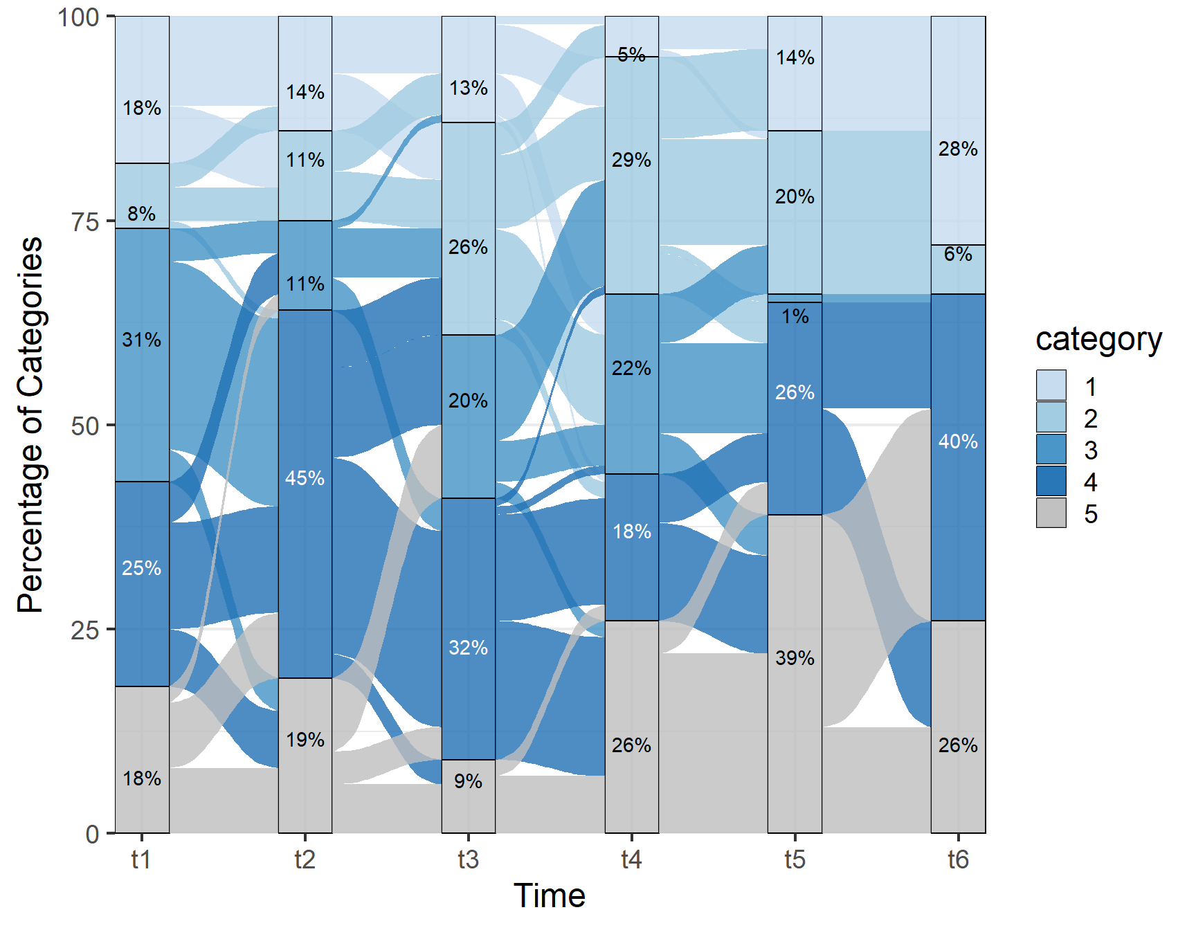
It is often of interest to understand and visualize how individuals transition between categories over time. As such, we will augment the barplots by including flows using alluvial plots. Another small tweak is to let the percentage label color change depending on the contrasting background via farver::decode_colour. The `flows’ are colored by the starting category.
Code
ggplot (example, aes (alluvium = ID, x = time , stratum = category)) + geom_stratum ( aes (fill= category,y= after_stat (prop)),decreasing = NA ,alpha= 0.8 ) + geom_flow (aes (fill= category),aes.flow = "forward" ,alpha = 0.8 ) + geom_text_repel (stat = "stratum" ,aes (color = stage (category, after_scale = ifelse (decode_colour (alpha (color, 0.8 ),"rgb" , "hcl" )[, "l" ] > 50 ,"black" ,"white" )label = percent (after_stat (prop), accuracy = 1 )),show.legend = FALSE ,direction= "y" )+ scale_y_discrete () + theme_bw (base_size = 18 )+ theme (axis.text = element_text (size = 12 ))+ scale_fill_manual (values= rev (c ("gray" ,"#2171B5" ,"#4292C6" , "#9ECAE1" ,"#C6DBEF" )))+ scale_color_manual (values= rev (c ("gray" ,"#2171B5" ,"#4292C6" , "#9ECAE1" ,"#C6DBEF" )))+ scale_y_continuous (expand = expansion (mult= c (0 ,0 ),add = c (0 ,0 )))+ scale_x_discrete ( expand = expansion (mult= c (0 ,0 ),add = c (0 ,0 ))) + theme_bw (base_size = 18 )+ theme (panel.border = element_blank ())+ labs (y= "Percentage of Categories" ,x= "Time" )
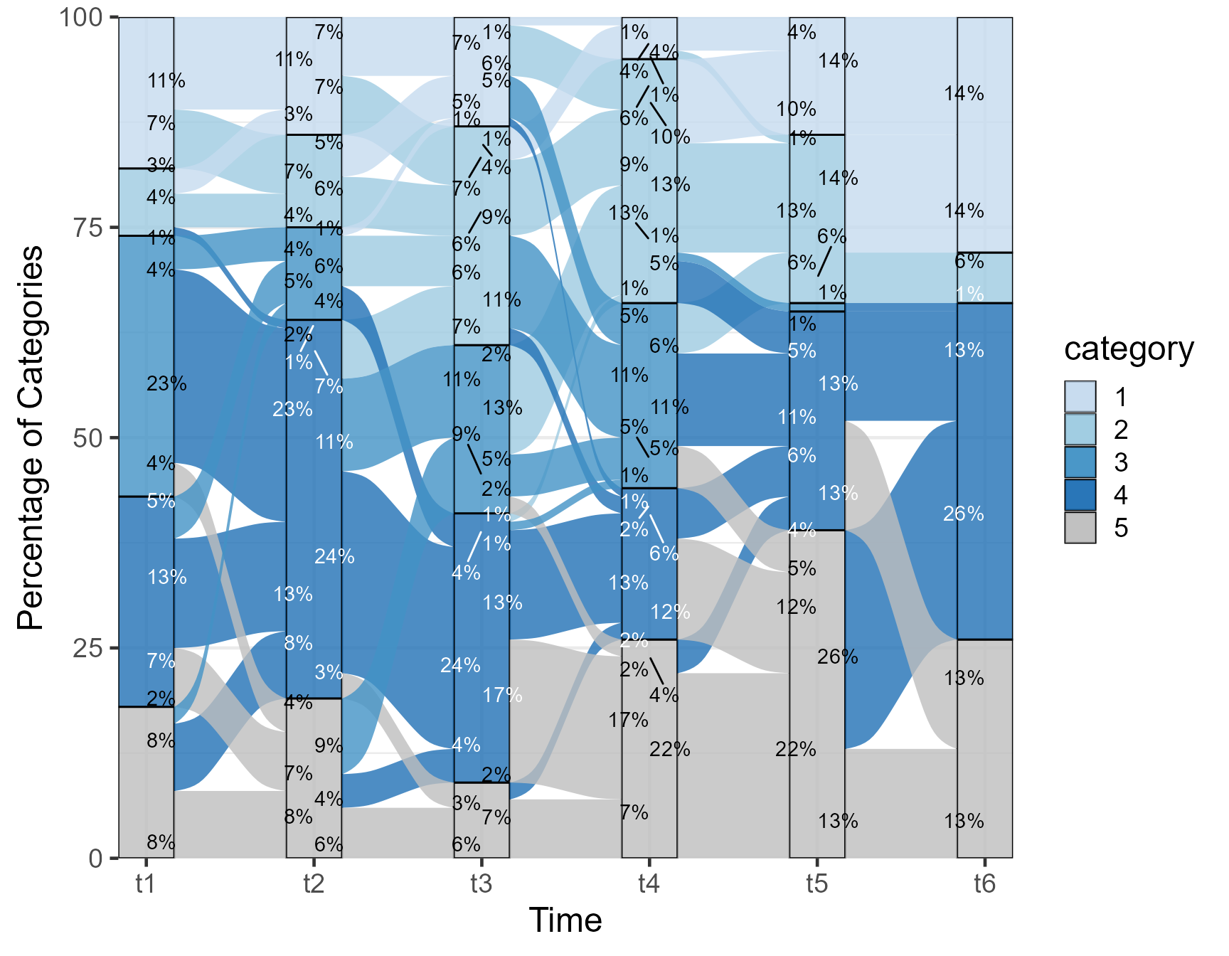
The previous plot showed the percentages in each category overall. Next we show the percentage undergoing each transition, coloring the flows the ending category.
Code
ggplot (example , aes (alluvium = ID, x = time, stratum = category)) + geom_stratum ( aes (fill= category,y= after_stat (prop)),alpha= 0.8 ) + geom_flow (aes (fill= category),aes.flow = "backward" ,alpha= 0.8 ) + geom_text_repel (stat = "flow" ,aes (color = stage (category, after_scale = ifelse (decode_colour (alpha (color, 0.8 ),"rgb" , "hcl" )[, "l" ] > 50 ,"black" ,"white" )label = after_stat (:: percent (ave (count, x, flow,PANEL, group, FUN = sum) / ave (count, x, flow,PANEL, FUN = sum),accuracy = 1 ) ),hjust = after_stat (flow) == "to" direction= "y" ,show.legend = FALSE )+ scale_y_discrete () + theme_bw (base_size = 18 )+ theme (axis.text = element_text (size = 12 ))+ scale_fill_manual (values= rev (c ("gray" ,"#2171B5" ,"#4292C6" , "#9ECAE1" ,"#C6DBEF" )))+ scale_color_manual (values= rev (c ("gray" ,"#2171B5" ,"#4292C6" , "#9ECAE1" ,"#C6DBEF" )))+ scale_y_continuous (expand = expansion (mult= c (0 ,0 ),add = c (0 ,0 )))+ scale_x_discrete ( expand = expansion (mult= c (0 ,0 ),add = c (0 ,0 ))) + theme_bw (base_size = 18 )+ theme (panel.border = element_blank ())+ labs (y= "Percentage of Categories" ,x= "Time" )
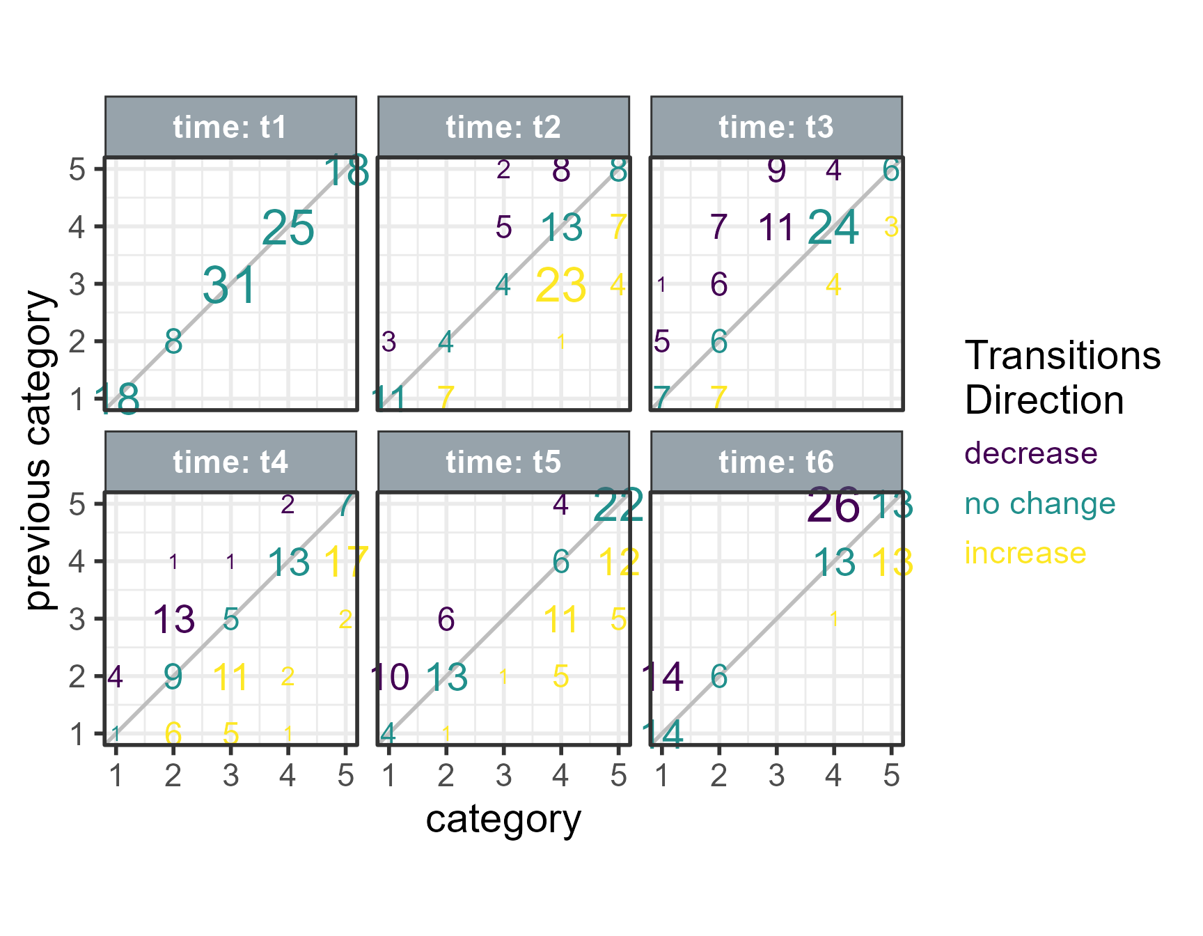
Next, I try something different. I reshape the data and plot the current category to where it ended next by time point. The text show the numbers and direction of transition. At the first time point t1 there is no transition all data are on the diagonal. At time t2, the 31 data points that were at category 3 are now split into:
4 at category 3,
23 at category 4
and 4 at category 5.
Code
<- example %>% group_by (ID) %>% mutate (category= as.double (category))%>% mutate (prevcategory= lag (category))%>% ungroup ()<- example.trans %>% group_by (time,category, prevcategory) %>% summarise (N= n ()) %>% ungroup ()<- example.trans %>% mutate (prevDV= ifelse (time== 0 ,category,prevcategory))%>% complete (time = c ("t1" ,"t2" , "t3" ,"t4" , "t5" ,"t6" ),prevcategory= 1 : 6 ,category= 1 : 6 ,fill= list (N= 0 ))%>% mutate (prevcategory= ifelse (time== "t1" ,category,prevcategory))%>% mutate ( transsign= ifelse (category- prevcategory> 0 ,"increase" ,ifelse (category- prevcategory== 0 ,"no change" ,"decrease" ))%>% filter (! is.na (prevcategory),N!= 0 )%>% mutate (transsign= factor (transsign,levels = c ("decrease" ,"no change" ,"increase" )))%>% ggplot (.,aes (category,prevcategory,label= N))+ geom_abline (color= "gray" )+ geom_text (alpha= 1 ,aes (colour= transsign, size= N),show.legend = c ( colour = TRUE ,size = FALSE ) + facet_wrap ( ~ time,labeller = labeller (time= label_both),ncol= 3 ,dir= "lt" )+ scale_x_continuous (breaks= c (1 ,2 ,3 ,4 ,5 ,6 ,7 ))+ scale_y_continuous (breaks= c (1 ,2 ,3 ,4 ,5 ,6 ,7 ))+ theme_bw (base_size = 22 )+ theme (strip.placement = "outside" ,strip.text.y.left = element_text (angle= 0 ),legend.position = "right" ,aspect.ratio = 1 ,strip.background = element_rect (fill = "#475c6b90" ), strip.text = element_text (face = "bold" ,color = "white" ))+ labs (y= "previous category" ,x= "category" ,size= "N \n Transitions" ,color= "Transitions \n Direction" )+ scale_size (range= c (4 ,10 ))+ coord_cartesian (clip= "off" )+ guides (colour = guide_stringlegend (ncol = 1 ))+ scale_color_viridis_d ()
With this post, I covered some techniques that can be useful to visualize longitudinal categorical data and set the stage for advanced modeling techniques such as multi-state markovian models.