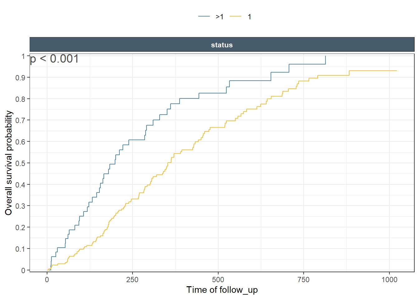
In this post, I will continue with the exposure response theme. The previous blog post focused on Binary response outcomes. In today’s post I will illustrate how to explore and communicate time to event outcomes. First we start using a specialized geom from my ggquickeda package: geom_km(). Since this is a native ggplot2 geom it supports, aesthetics, faceting and margins, themings and anything else you expect from a ggplot2 object. Later on I cover the usage of the specialized ggkmrisktable function that support adding number at risk tables and more.
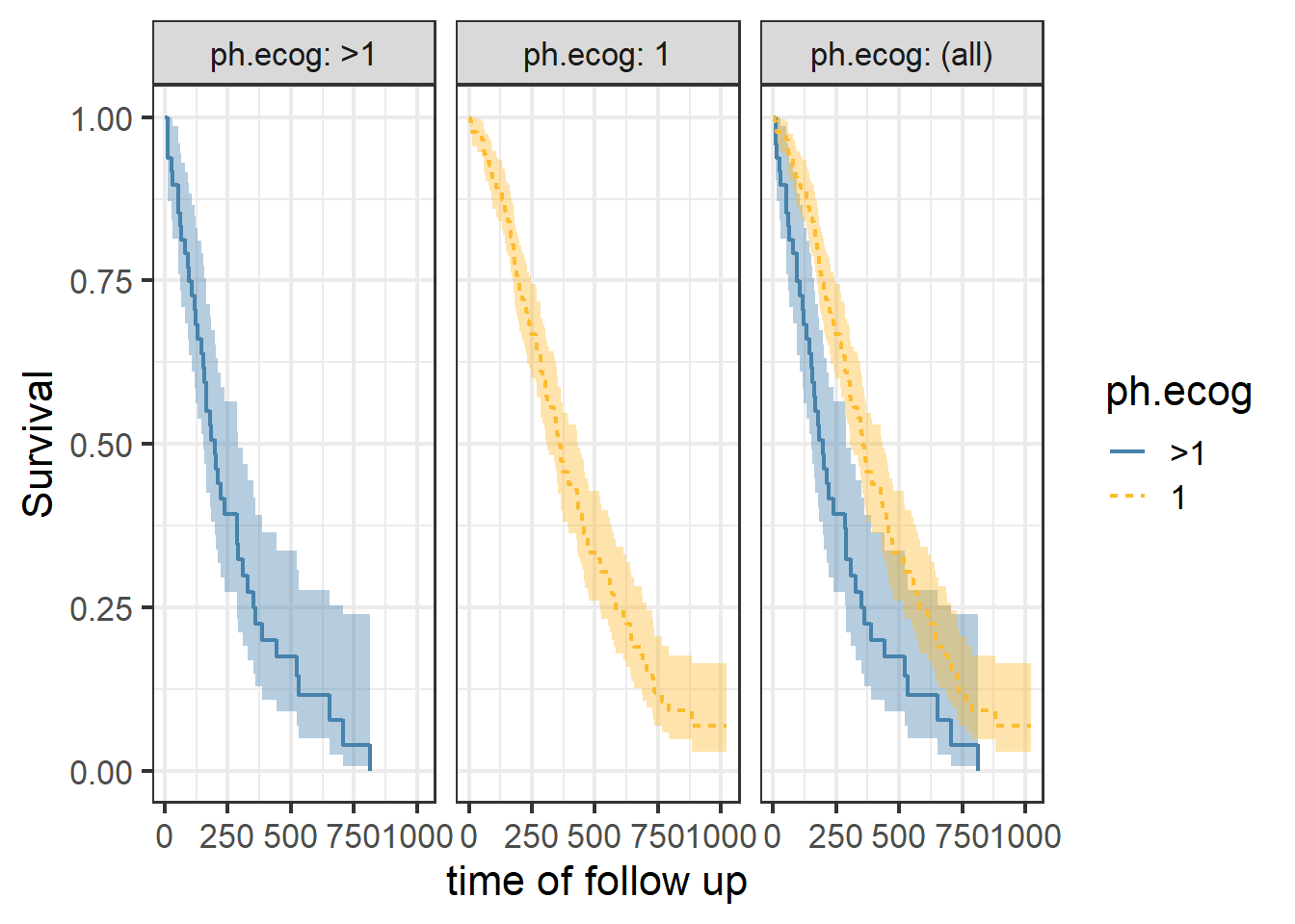
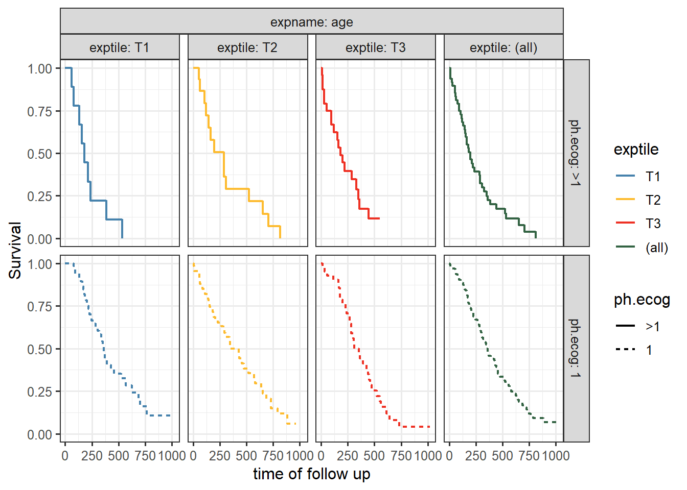
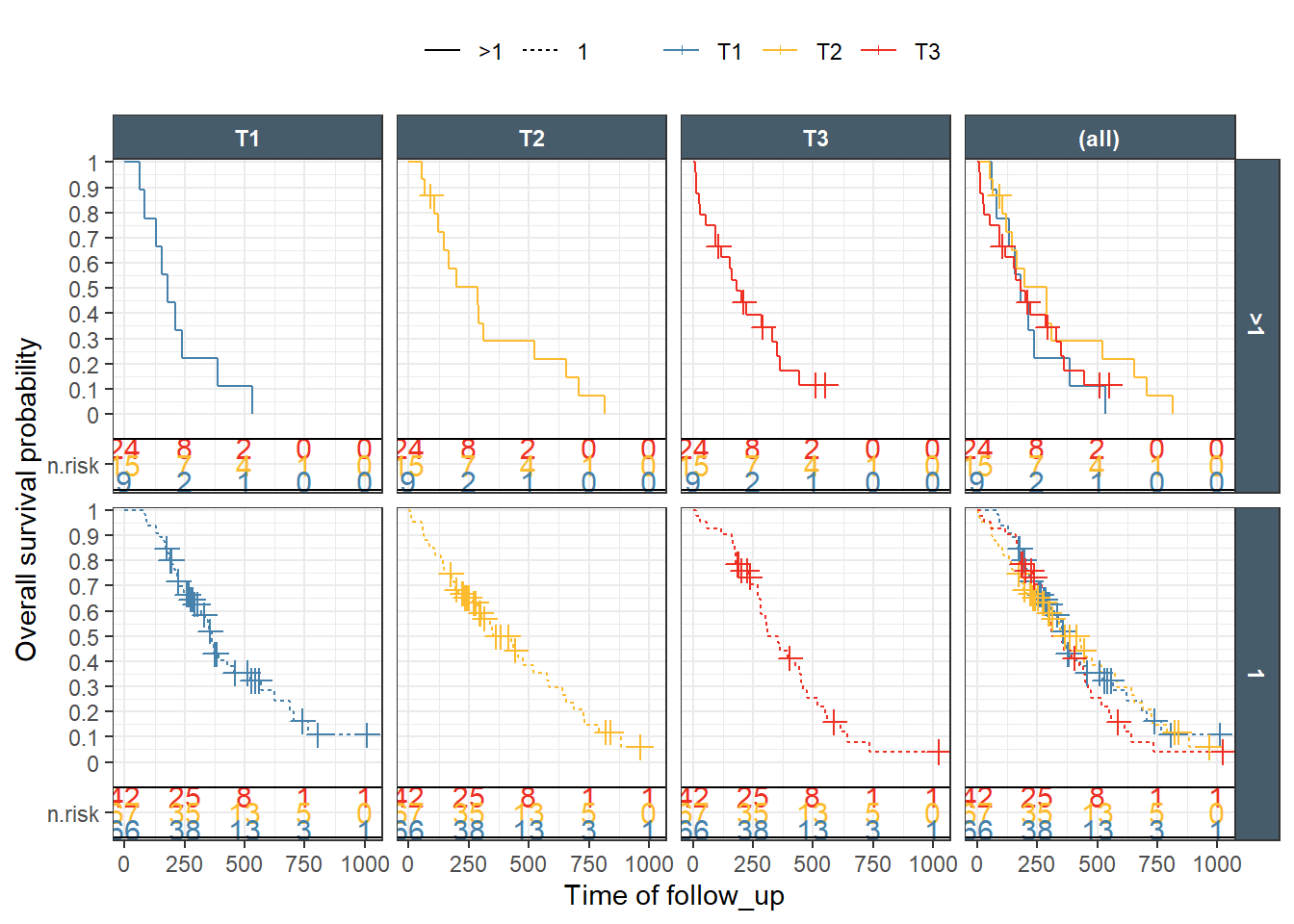
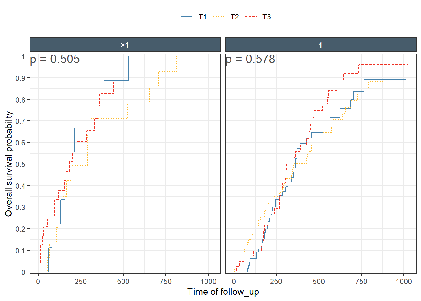
This is a nice Kaplan-Meir plot that shows the K-M estimate by ecog status and both overlaid in the facet margin (all) panel. To include the effects of continuous variables, we will need to “bin” it. I will use age as a example predictor binning it by tertiles. Some nice features are outlined below:
This is a ggplot object and we can facet by any variable available in the dataset. Furthermore, I will illustrate the usage of the nice facet_nested from the ggh4x package to group facet strips that belong to the same level.
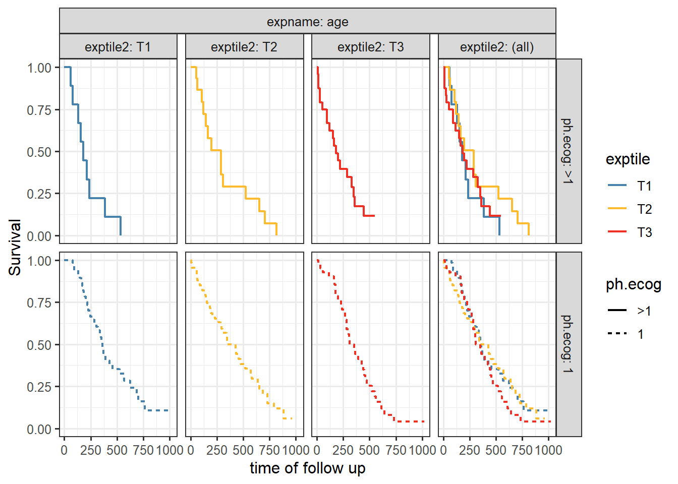
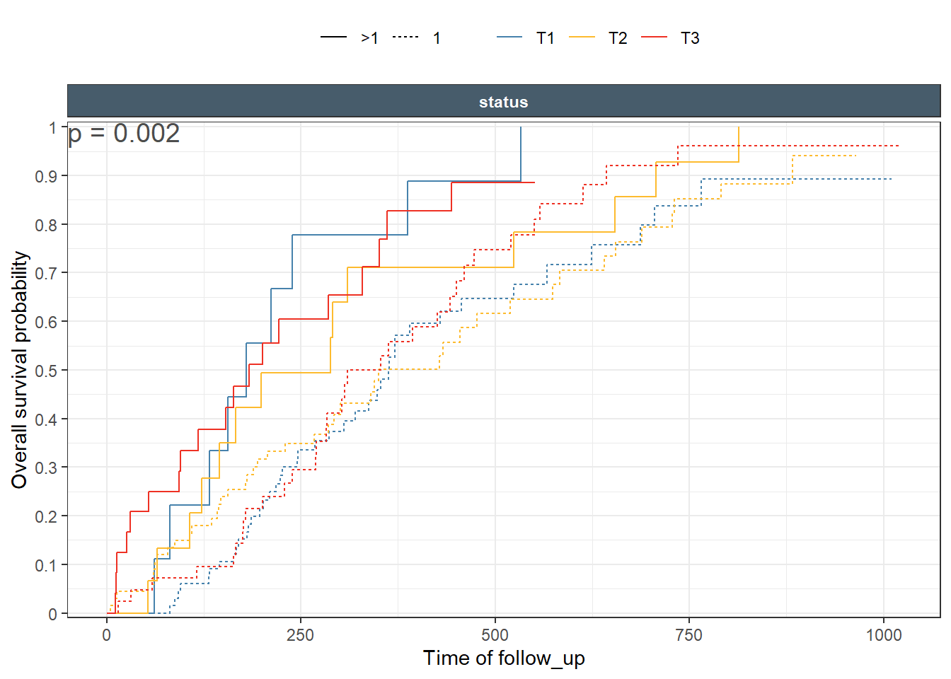
The plot is done in two ways using exptile as color and faceting variable which result in a facet margin (all) having the pooled estimate (all tertiles combined). Then, using exptile as color and faceting by an exact copy of it that we call exptile2. This tricks ggplot2 margins to overlay the three tertiles curves in the (all) panels.
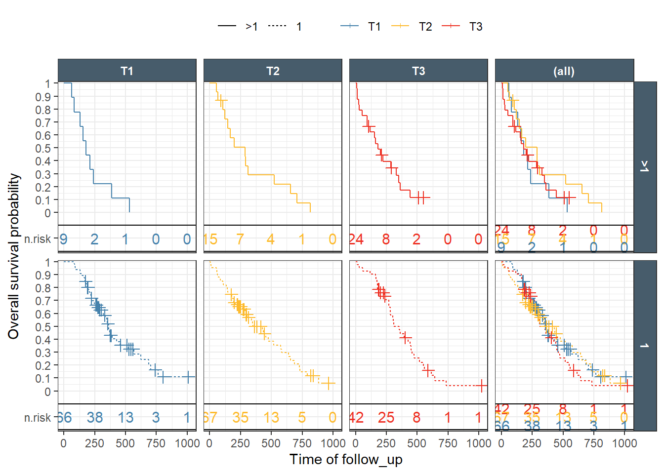
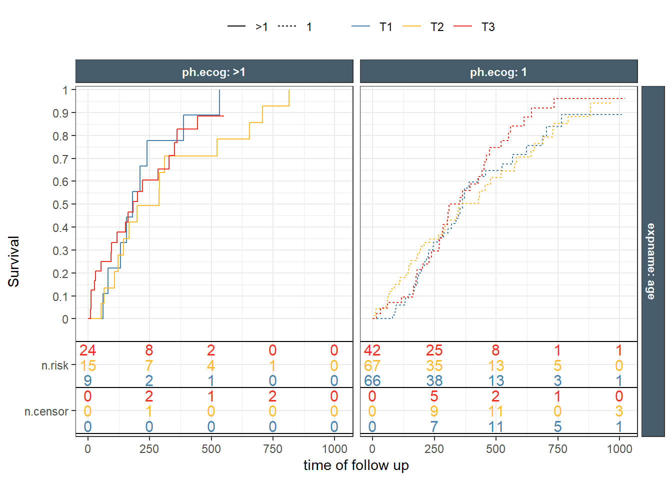
It is common for these type of plots to present a transformation of the default which is the probability of not having the event . For example, changing it to cumulative hazard, or to event probability. It is also desirable to have a number at risk table underneath the plot. ggkmrisktable was written to facilitate and automate these tasks with several flexible options. First, we try to reproduce the last two plot. Notice how exptile2 is available automatically to enable different margins.
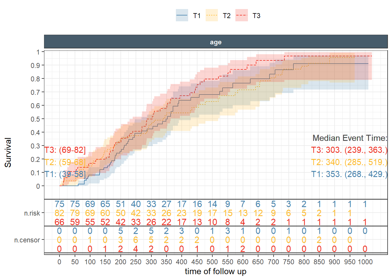
The use of additional options like showing the tertiles cutoffs, the median survival, controlling the order and the interval at which numbers at risk appear is shown next.
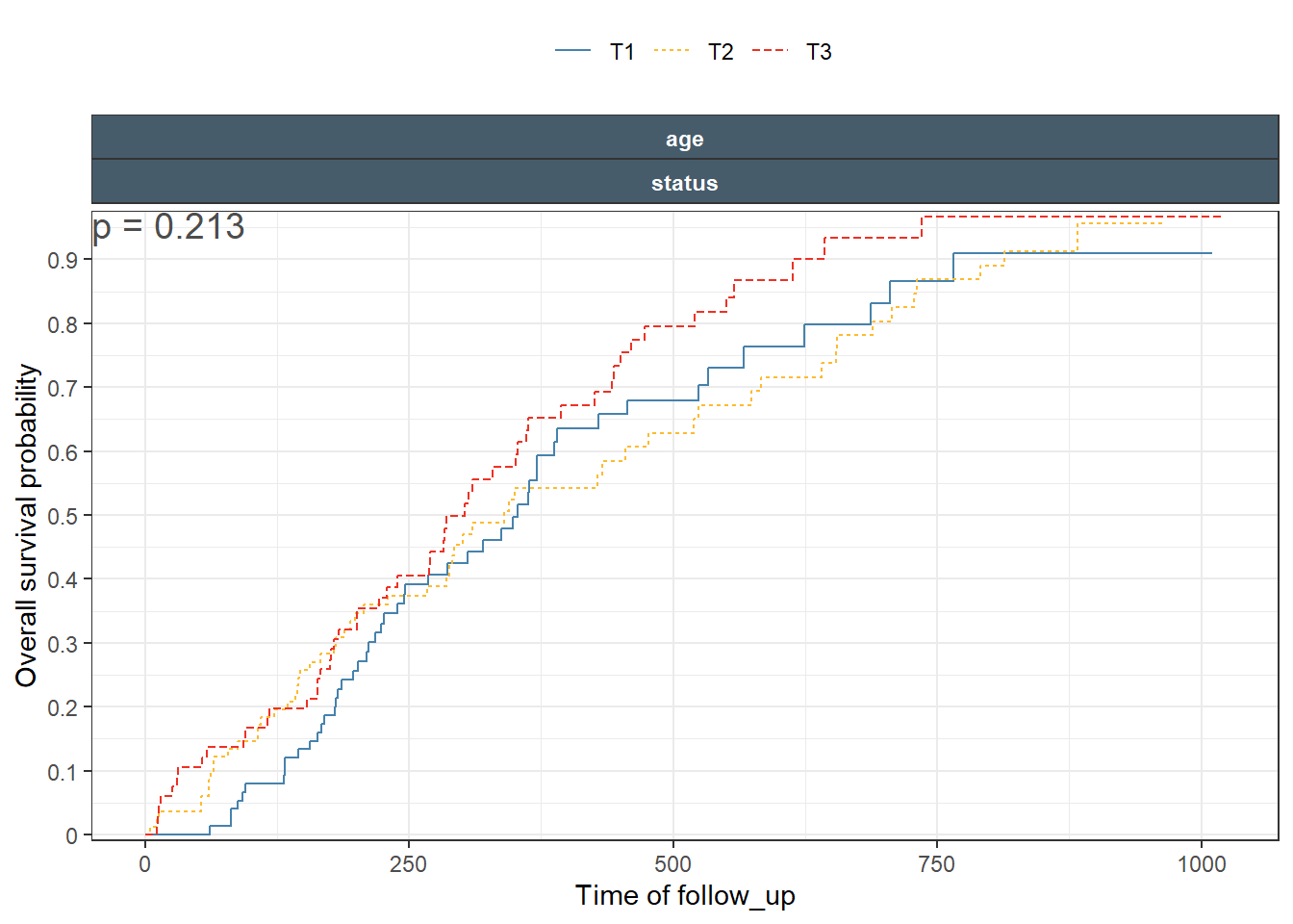
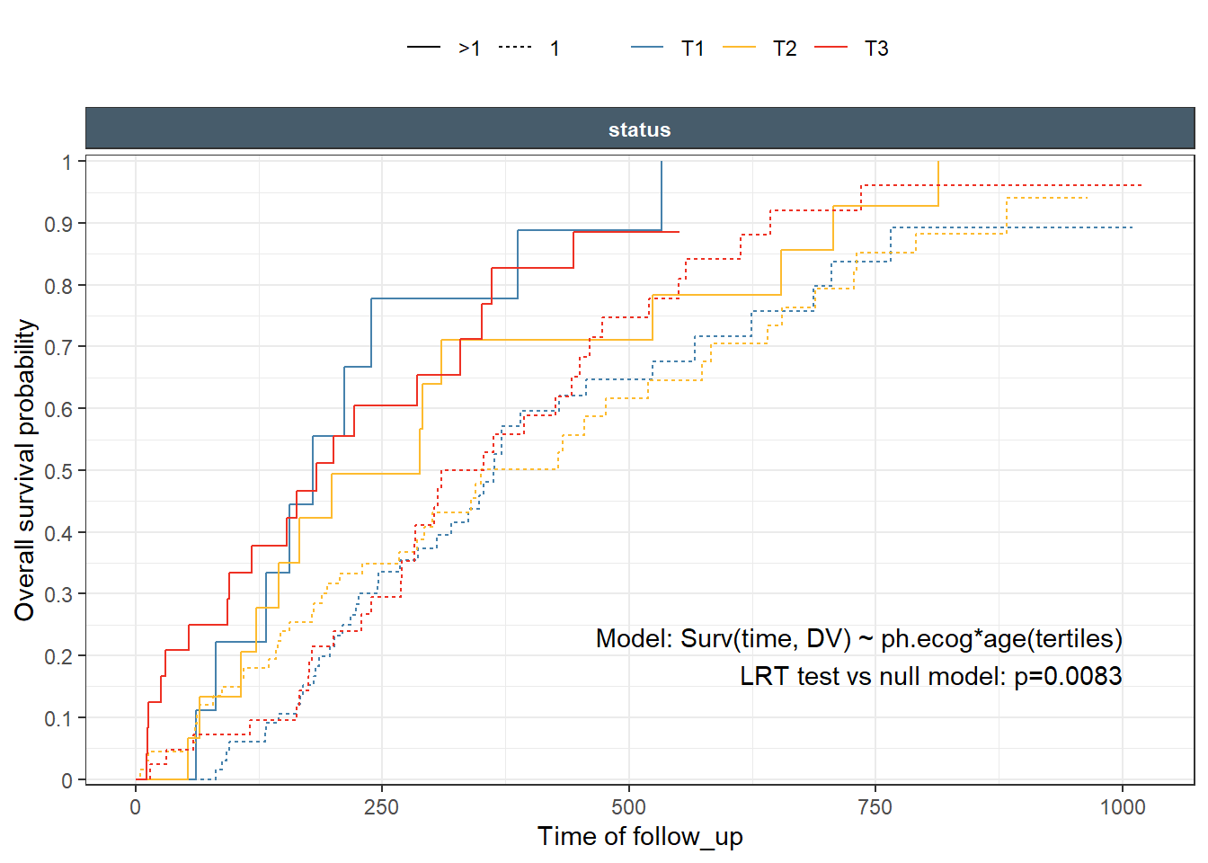
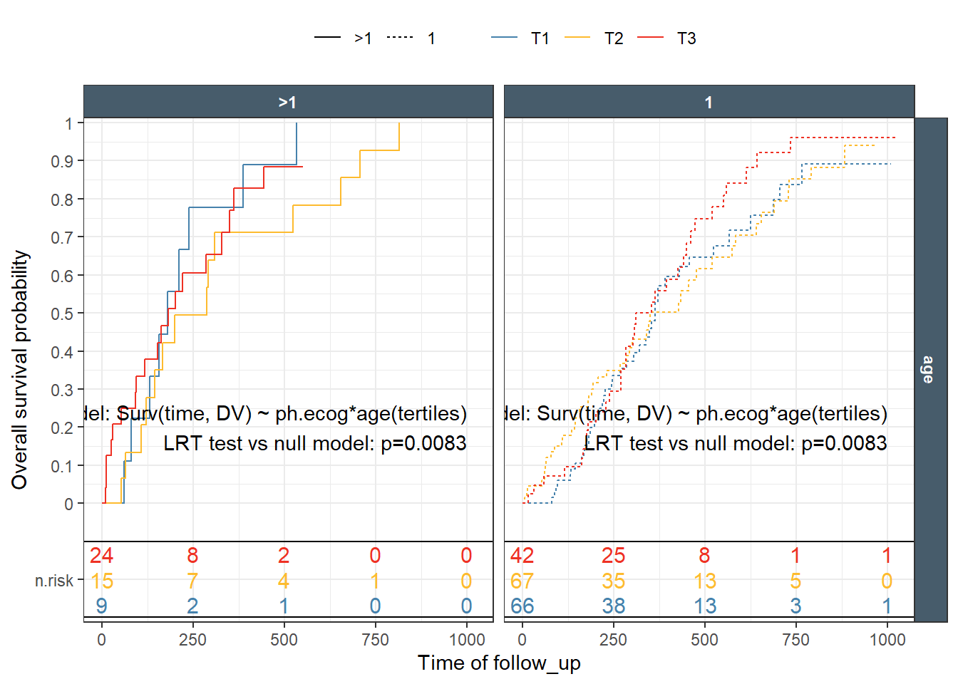
While the function supports computing and printing p-values, I strongly, recommend that one run the statistical tests outside of the function. Make sure to document what test was done, on which data. Then we included the appropriate information using regular text/lable ggplot2 layer. An example, showing how to do an LRT on a cox fit is included.
One would expect that the p-values shown in each panel are specific for the subset of panel data comparing the curves. While the case of single split, are clear, things get out of control fast when we have multiple splits/predictors and then deciding on what particular test we really want. Is it overall on all data ar within a specific strata/subset?
A global test across multiple variables that enter the survival equation, with or without interaction can be needed. For these, Idefinitely recommend to avoid using the automatic built-inp-values. The ggkmrisktable has groupvar1, groupvar2, and groupvar3 variables to give the user more control on how to “group” to test p-values but possibilities remain limited as compared to controlling the test with user-written code.