Totality of evidence of Repurposed Therapies

Drug Repurposing
visualization
Author

Samer Mouksassi

Published

November 24, 2025

During the COVID-19 pandemic, both randomized controlled trials (RCTs) and observational “real‐world studies” (RWS) were deployed. RWS mainly used existing pharmacotherapeutic interventions (repurposed treatments) and could report more quickly. In this paper Totality of evidence of the effectiveness of repurposed therapies for COVID-19: Can we use real-world studies alongside randomized controlled trials? our intent was to compare and to determine the potential value and contribution of each research channel. Analysis of all‐cause mortality data from 249 observational RWS and RCTs across eight treatment interventions for COVID‐19 showed that RWS yield more heterogeneous results, and generally overestimated the effect size subsequently seen in RCTs. Refer to paper for the full details on how we assessed the accumulation of evidence over time since the start of the pandemic and the recommendations we have proposed to improve both speed and quality of decision making for future pandemics. In this post, I will go over some of the key visuals that were used to communicate the findings.

I start with a simple plot to visualize eight meta-analyses results of eight different drugs and overall (pooled), the point estimates and 95% CI are shown using a pointinterval:

Code
library(tidyr)
library(dplyr)
require(ggplot2 )
library(patchwork)
library(ggquickeda)
library(ggh4x)
library(ggrepel)
library(scales)

figure2data <- read.csv("figuredata.csv")
figure2data$xmid  <- exp(figure2data$est)
figure2data$xlow  <- exp(figure2data$est - 1.96 *figure2data$se)
figure2data$xhigh <- exp(figure2data$est + 1.96 *figure2data$se)
figure2data <- figure2data %>%
  mutate(midlabel = format(round(xmid,2), nsmall = 2),
         lowerlabel = format(round(xlow,2), nsmall = 2),
         upperlabel = format(round(xhigh,2), nsmall = 2),
         LABEL = paste0(midlabel, " [", lowerlabel, "-", upperlabel, "]"))
figure2data$randomized <- figure2data$type 
figure2data$ynumeric <- ifelse(figure2data$type =="randomized",1,2)
figure2data$facet <- as.factor(figure2data$facet)
figure2data$facet  <- reorder(figure2data$facet ,figure2data$N)
figure2data <- figure2data %>% 
  arrange(facet,N)
figure2data$facetorder <- rep(1:9,each=2)
figure2data$randomized<- gsub(" ","~", figure2data$randomized)

figure2data$facet  <- reorder(figure2data$facet ,figure2data$N)
figure2data$facet <- reorder(as.factor(figure2data$facet),figure2data$facetorder)

ggplot(figure2data)+
  geom_vline(xintercept= 1,size=2,color="gray",alpha=0.9)+
  geom_pointrange(aes(col=rct,
                      x=xmid,xmin=xlow,xmax=xhigh,
                      y=as.factor(ynumeric)),
                  position = position_dodge(width = 0.4))+
  scale_y_discrete(expand = c(1,1,1,1))+
  theme_bw()+
  theme(strip.background = element_blank(),
        strip.text.x=element_text(hjust=0,face="bold", color="#3764b0",size=12),
        axis.title.y.left = element_blank(),
        axis.text.y.left = element_blank(),
        axis.ticks.y.left = element_blank(),
        axis.title  = element_text(size=14), 
        axis.text.x = element_text(size=12),
        panel.background = element_rect(),
        panel.grid.major = element_blank(),
        panel.grid.minor = element_blank(),
        axis.line.y.left = element_blank(),
        legend.position = "none",
        legend.position.inside = c(0.9,0.9)
  )+
  facet_wrap(~facet)+
  labs(col="",fill="")+
  scale_x_continuous("Odds Ratio of Death",
                     trans="log",
                     breaks= c(1/8,1/4,1/2,1,2),
                     labels= c("1/8","1/4","1/2","1","2"),
                     expand = c(0.4,0,0.4,0),limits = c(1/8,3)
  ) +
  theme_bw()+
  scale_color_manual(values=c("#b04782","#73ae95","#2297e6","#28e2e5"))+
  scale_fill_manual( values=c("#b04782","#73ae95","#2297e6","#28e2e5"))+
  facet_wrap(~facet)+
  scale_x_log10()+
  labs(col="",fill="")+
  theme(legend.position = "top",y="")

However, traditionally meta-analyses results are shown as diamond shapes. We fix this using a small function data_to_diamond that transform the data from values of xmin,x, xmax and y, to the needed x/y geom_polygon data duplicating the mid point and adding and subtracting the height of diamond shape polygon:

Code
source("plot_function.r")
data_to_diamond <- function(data = figure2data,
                            diamondheight =0.2){
  plotdata <- data 
  diamonddataset <- data.frame(
    x = c(plotdata$xlow    , plotdata$xmid,
          plotdata$xhigh   , plotdata$xmid),
    y = c(plotdata$ynumeric, plotdata$ynumeric + diamondheight,
          plotdata$ynumeric, plotdata$ynumeric - diamondheight),
    ynumeric   = rep(plotdata$ynumeric,4),
    randomized = rep(plotdata$randomized,4),
    rct        = rep(plotdata$rct,4),
    facet      = rep(plotdata$facet,4),
    facetorder = rep(plotdata$facetorder,4),
    names      = c("xmin", "ymax", "xmax", "ymax")
  ) %>% 
    arrange(ynumeric)
    diamonddataset
}

ggplot(figure2data) +
  geom_polygon(
    data =   data_to_diamond(figure2data),
    aes(x = x,
        y = y,
        group = as.factor(ynumeric),
        fill = rct
    ),
    alpha = 0.5
  ) +
  geom_pointrange(
    aes(
      x = xmid,
      y =  as.factor(ynumeric),
      xmin = xlow,
      xmax = xhigh,
      col = rct)) +
  theme_bw()+
  scale_color_manual(values=c("#b04782","#73ae95","#2297e6","#28e2e5"))+
  scale_fill_manual( values=c("#b04782","#73ae95","#2297e6","#28e2e5"))+
  facet_wrap(~facet)+
  scale_x_log10()+
  scale_y_discrete()+
  labs(col="",fill="")+
  theme(legend.position = "top",y="")

A meta-analysis forest plot, also adds information on the number of studies, number of patients in treatment/control arms, number of patients experiencing the outcome, a side table with the Odds Ratios (ORs) and associated 95% confidence intervals, and any other relevant stats of interests. The paper Figure 2 reported a patchwork of several plots arranged as columns showing the intented numbers/stats and adding/removing the graphical elements that are not needed for each plot:

Code
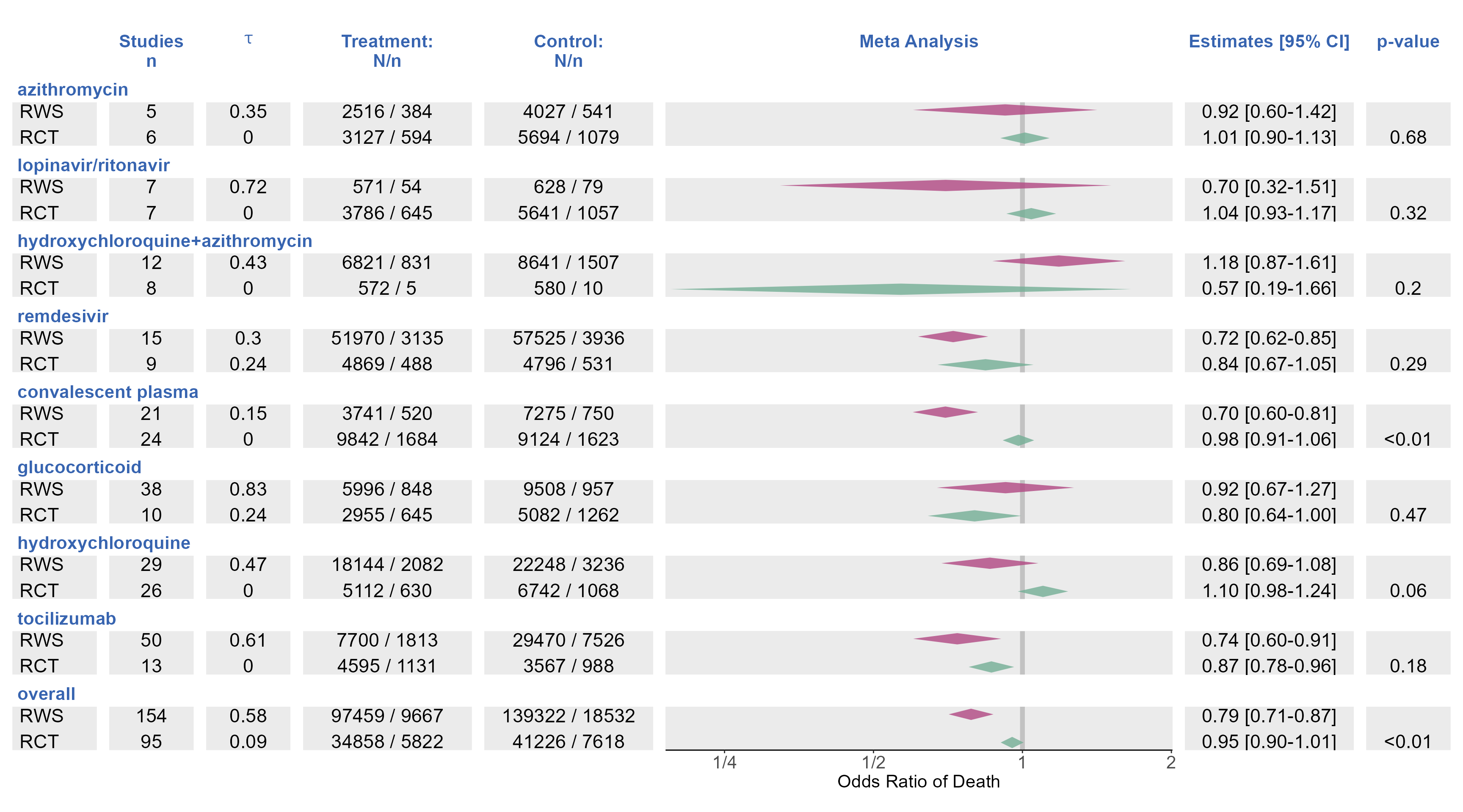
p_trt_name <- ggplot(data=figure2data)+
  geom_text(aes(label=rct,y=ynumeric),x=0,hjust=0,vjust="inward",size=6, parse = TRUE)+
  facet_wrap(facet~.,strip.position = "top",ncol=1,scales = "free_y")+
  labs(title= expression(bold(paste(" "))))+
  scale_x_continuous(expand = c(0.1,0,0.1,0),
                     limits=c(0,0.6),
                     breaks = NULL)+
  theme1

p_studies <- ggplot(data=figure2data,)+
  geom_text(aes(label=N,y=ynumeric),
            x=0.5,hjust=0.5,size=6,vjust="inward")+
  facet_wrap(facet~.,strip.position = "top",ncol=1,scales = "free_y")+
  labs(title=" ",
       subtitle= "Studies\nn")+
  scale_x_continuous(expand = c(0,0,0,0),limits=c(0,1),breaks = NULL)+
  theme2

p_trt_N <-  ggplot(data=figure2data[,],)+
  geom_text(aes(label=paste(Nendpoint,Nevent,sep=" / "),y=ynumeric),
            x=0.5,hjust=0.5,size=6,vjust="inward")+
  facet_wrap(facet~.,strip.position = "top",ncol=1,scales = "free_y")+
  labs(title=" ",
       subtitle= "Treatment:\nN/n")+
  scale_x_continuous(expand = c(0,0,0,0),limits=c(0,1),breaks = NULL)+
  theme2

p_ctl_N <- ggplot(data=figure2data,)+
  geom_text(aes(label=paste(Ncontrol ,Neventcontrol,sep=" / "),y=ynumeric),
            x=0.5,hjust=0.5,size=6,vjust="inward")+
  facet_wrap(facet~.,strip.position = "top",ncol=1,scales = "free_y")+
  labs(title=" ",
       subtitle= "Control:\nN/n")+
  scale_x_continuous(expand = c(0,0,0,0),limits=c(0,1),breaks = NULL)+
  theme2


p_tau <- ggplot(data=figure2data,)+
  geom_text(aes(label=paste( round(tau,2)),y=ynumeric),
            x=0.5,hjust=0.5,size=6,vjust="inward")+
  facet_wrap(facet~.,strip.position = "top",ncol=1,scales = "free_y")+
  labs(title=" ",
       subtitle= expression(bold(tau)))+
  scale_x_continuous(expand = c(0,0,0,0),limits=c(0,1),breaks = NULL)+
  theme2

p_diamonds <- plot_forest_diamond(data = figure2data,
                                  logx=TRUE, greektau = TRUE,
                                  xlimits = c(0.19,2.01),
                                  xbreaks = c(1/8,1/4,1/2,1,2),
                                  xlabels = c("1/8","1/4","1/2","1","2"),
                                  expandleft=0,
                                  expandright=0,
                                  stripx.text.color="transparent")+
  labs(title=" ",subtitle= "Meta Analysis")+
  theme2

p_95 <- ggplot(data=figure2data,)+
  geom_text(aes(label=LABEL,y=ynumeric),
            x=0.5,hjust=0.5,size=6,vjust="inward")+
  facet_wrap(facet~.,strip.position = "top",ncol=1,scales = "free_y")+
  labs(title=" ",
       subtitle = expression(bold(paste("Estimates [95% CI]"))))+
  scale_x_continuous(expand = c(0,0,0,0),limits=c(0,1),breaks = NULL)+
  theme2

p_pvalue <- ggplot(data=figure2data,)+
  geom_text(aes(label=ifelse(p<0.01,"<0.01",p),y=ynumeric),
            x=0.5,hjust=0.5,size=6,vjust="inward")+
  facet_wrap(facet~.,strip.position = "top",ncol=1,scales = "free_y")+
  labs(title=" ",
       subtitle= expression(bold(paste("p-value"))))+
  scale_x_continuous(expand = c(0,0,0,0),limits=c(0,1),breaks=NULL)+
  theme2


#ggsave("forestplot_redo.png",foresplot,width =20 ,height = 10.4, dpi = 300)

(p_trt_name | p_studies |p_tau |p_trt_N | p_ctl_N |p_diamonds| p_95|p_pvalue)+
  plot_layout(widths = c(0.1,0.1,0.1,0.2,0.2,0.6,0.2,0.1))

The theme elements were fine-tuned specifying strip.clip = "off" to let the first column plot facet strip text overflow into the next plot/column while turning the text transparent in the rest. Final touches of the plot were done in PowerPoint after exporting into editable Microsoft objects:

library(export)
graph2ppt(foresplot,file = "Rplot.pptx", vector.graphic = TRUE,
          margins = c(top = 0, right = 0, bottom = 0, left = 0),
          center = TRUE,
          aspectr  = 20/10.4,
          offx = 0,
          offy = 0,
          upscale = TRUE,append = TRUE )

The most interesting part of the paper was to study how the evidence accumulates over time. As new RWS and RCT trials data trickled in, the meta-analysis was updated. Below I show the N of patients contributing to the evidence as new trials comes in. Several approaches are shown:

  1. A stepped line is used where we have a jump accumulating the N with every new trial

  2. The same but with a point added with size proportional to the trial size to emphasize the individual size of each trial instead of letting the viewer analyze the height of the jumps

  3. Removing the stepped line, individual points an sizes are kept but the cumulative size is communicated using the width of the line

    What would be your preferred way to communicating the N of patients of each trial and how the N accumulates over time? 1. 2. or 3. ?

Code
NDATA <- read.csv("NDATA.csv")
oddsDATA <- read.csv("oddsDATA.csv")
oddsDATArct <- read.csv("oddsDATArct.csv")
tmp <- read.csv("tmp.csv")
tmp$RCT <- ifelse(tmp$randomization=="yes","RCT","RWS")
tmp$RCT <- reorder(factor(tmp$RCT),tmp$n.endpoint,function(x) median(x,na.rm = TRUE)) 
tmp$RCT <- factor(tmp$RCT , levels = c("RWS","RCT"))
NDATA$`Cum N`<-NDATA$Cum.N

                      #disease.severity.group2==""

tmb <- tmp %>%
               select(pub.day,or,size,RCT,trt.disease,class,disease.severity.group2)
Code
a <- ggplot(NDATA %>% 
         filter(class%in% c("tocilizumab","hydroxychloroquine",
                            "azithromycin"),
                severity=="all"),
        aes(pandemicday,`Cum N`, color=Ntype))+
  geom_step(alpha=0.5,linewidth = 2)+
  geom_text(data=NDATA %>% 
         filter(class %in% c("tocilizumab","hydroxychloroquine",
                            "azithromycin"),severity=="all") %>%
              group_by(Ntype,class) %>%
              filter(!is.na(N))%>%
              slice(n()), aes(x=pandemicday,
                              y= `Cum N`,
                              label=paste0(Ntype,": ",`Cum N`)),
            hjust=0.5,show.legend = FALSE,
            nudge_y = -2000,size=4)+
  guides( shape = "none",color="none",
          linewidth = guide_legend(position = "top"))+
  labs(x = "Pandemic Day",y="Cumulative N",col="")+
  scale_y_continuous(
    labels = scales::label_number(scale_cut = cut_short_scale()))+
  scale_color_manual(values=c("#73ae95","#b04782"))+
  scale_x_continuous(expand = expansion(add = c(5, 40), mult= c(0, 0)),
                     breaks =  c(200,400,600,800))+
  coord_cartesian(xlim=c(150,800),clip="off")+
  theme_bw(base_size = 16)+
  theme(legend.position = "right",
        legend.box = "horizontal",
        legend.spacing.y =unit(0.01, 'cm'),
        legend.background = element_rect(fill="transparent"),
        legend.box.just = "left")+
     facet_grid(~class)

b <-  ggplot(NDATA %>% 
         filter(class%in% c("tocilizumab","hydroxychloroquine",
                            "azithromycin"),
                severity=="all"),
        aes(pandemicday,`Cum N`, color=Ntype))+
  geom_step(alpha=0.5,)+
  geom_point(alpha=0.5,aes(size=N ,shape=Ntype))+
  geom_text(data=NDATA %>% 
         filter(class %in% c("tocilizumab","hydroxychloroquine",
                            "azithromycin"),severity=="all") %>%
              group_by(Ntype,class) %>%
              filter(!is.na(N))%>%
              slice(n()), aes(x=pandemicday,
                              y= `Cum N`,
                              label=paste0(Ntype,": ",`Cum N`)),
            hjust=0.5,show.legend = FALSE,
            nudge_y = -2000,size=4)+
  guides( shape = "none",color="none",size = "none")+
  labs(x = "Pandemic Day",y="Cumulative N",col="")+
    scale_x_continuous(expand = expansion(add = c(5, 40), mult= c(0, 0)),
                     breaks =  c(200,400,600,800))+
  scale_y_continuous(labels = scales::label_number(scale_cut = cut_short_scale()))+
  scale_color_manual(values=c("#73ae95","#b04782"))+
  scale_shape_manual(values=c("triangle","circle"))+
  coord_cartesian(xlim=c(150,800),clip="off")+
  theme_bw(base_size = 16)+
  theme(legend.position = "right",
        legend.box = "horizontal",
        legend.spacing.y =unit(0.01, 'cm'),
        legend.background = element_rect(fill="transparent"),
        legend.box.just = "left")+
     facet_grid(~class)

c <- ggplot(NDATA %>% 
         filter(class%in% c("tocilizumab","hydroxychloroquine",
                            "azithromycin"),
                severity=="all"),
        aes(pandemicday,Ntype, color=Ntype))+
  geom_line(alpha=0.2,aes(linewidth = sqrt(`Cum N`)))+
  geom_point(alpha=0.5,aes(size=N ,shape=Ntype))+
  guides( shape = "none",color="none",
          size = guide_legend(position = "right",nrow = 2))+
  labs(x = "Pandemic Day",y="",col="",linewidth = "sqrt(cumsum(N))")+
  scale_color_manual(values=c("#73ae95","#b04782"))+
  scale_shape_manual(values=c("triangle","circle"))+
    scale_x_continuous(expand = expansion(add = c(5, 40), mult= c(0, 0)),
                     breaks =  c(200,400,600,800))+
  coord_cartesian(xlim=c(150,800),clip="off")+
  theme_bw(base_size = 16)+
  theme(legend.position = "none",
        legend.box = "vertical",
        #legend.direction = "horizontal",
        legend.spacing.y =unit(0.01, 'cm'),
        legend.background = element_rect(fill="transparent"),
        legend.box.just = "left")+
     facet_grid(~class)

 (a/b/c)+ plot_annotation(tag_levels = '1',tag_suffix = '.') & 
  theme(plot.tag = element_text(size = 12))

The paper included a separate plot by drug showing the Odds Ratios versus Pandemic Day and just below it option 1. from above. The paper had a separate plot by drug but below we keep the facets:

Code
p1 <- ggplot(tmp %>%
               select(pub.day,or,size,RCT,trt.disease,class) %>% 
               filter(trt.disease %in% c("azithromycin",
                        "hydroxychloroquine","tocilizumab")))+
    geom_point(
         aes(pub.day,or,size=size,col=RCT,shape=RCT),alpha=0.3)+
      scale_color_manual(values=c("#b04782","#73ae95"))+
      scale_size( range = c(0.1,10))+
      scale_y_log10(breaks=c(0.1,0.125,0.25,0.5,1,2,3,4,10),
                    labels=c("1/10"," 1/8 "," 1/4 "," 1/2 ","1","2","  3","  4","10"),
                    expand = expansion(add = c(0, 0), mult= c(0.1, 0.1)))+
    labs(x = "Pandemic Day",y="Odds-ratio for death",
         col="Source",shape="Source")+
      guides(size= "none",
             color = guide_legend(override.aes = list(size=3)))+
    theme_bw(base_size = 16)+
  facet_grid(~trt.disease)+
  theme(legend.position = "none",
        legend.position.inside = c(0.2,0.2))

p1/a

Code
library(pammtools)

Next, I add the ORs with dynamically updated after each trial. Here we have two sets of ORs in blue based on a pooled of RWS and RCT analysis and using RCTs only in green:

Code
a<- ggplot(tmp %>%
         select(pub.day,or,size,RCT,trt.disease,class) %>% 
         filter(trt.disease %in% c("tocilizumab")))+
  geom_point(
    aes(pub.day,or,size=size,col=RCT,shape=RCT),alpha=0.3)+
  geom_stepribbon(data=oddsDATA%>%
                    filter(class == "tocilizumab", severity == "all"),
                  aes(x=pandemicday,
                      ymin = ifelse(ymin<0.25,0.25,ymin),
                      ymax = ifelse(ymax>4.1,4.1,ymax) ),
                  alpha=0.2,color="transparent",fill="steelblue")+
  geom_stepribbon(data=oddsDATArct%>%
                    filter(class == "tocilizumab", severity == "all"),
                  aes(x=pandemicday,
                      ymin = ifelse(ymin<0.25,0.25,ymin),
                      ymax = ifelse(ymax>4.1,4.1,ymax) ),
                  alpha=0.2,color="transparent",fill="#73ae95")+
  geom_step(data=oddsDATA%>%
              filter(class == "tocilizumab", severity == "all"),
            aes(x=pandemicday,y = ifelse(exp(estimate) >4.1,4.1,exp(estimate))),
            size=2,col="steelblue",alpha=0.5)+
  geom_step(data=oddsDATArct%>%
              filter(class == "tocilizumab", severity == "all"),
            aes(x=pandemicday,y = ifelse(exp(estimate) >4.1,4.1,exp(estimate))),
            size=2,col="#73ae95",alpha=0.5)+
  scale_color_manual(values=c("#b04782","#73ae95"))+
  scale_size( range = c(0.1,6))+
  scale_y_log10(breaks=c(0.1,0.125,0.25,0.5,1,2,3,4,10),
                labels=c("1/10"," 1/8 "," 1/4 "," 1/2 ","1","2","  3","  4","10"),
                expand = expansion(add = c(0, 0), mult= c(0, 0)))+
  scale_x_continuous(expand = expansion(add = c(5, 40), mult= c(0, 0)),
                     breaks = c(200,300,400,500,600,700,800) )+
  labs(x = "Pandemic Day",y="Odds-ratio for death",
       col="Source",shape="Source",subtitle = "Tocilizumab")+
  guides(size= "none",
         color = guide_legend(override.aes = list(size=3)))+
  theme_bw(base_size = 16)+
  theme(legend.position = "none",
        legend.position.inside = c(0.2,0.2),
        plot.subtitle = element_text(face="bold"))+
  coord_cartesian(ylim = c(1/4,4),expand = TRUE,
                  xlim=c(150,800),clip="on")


b <- ggplot(NDATA %>% 
         filter(class%in% c("tocilizumab"),
                severity=="all"),
       aes(pandemicday,`Cum N`, color=Ntype))+
  geom_step(alpha=0.5,linewidth = 2)+
  geom_text(data=NDATA %>% 
              filter(class %in% c("tocilizumab"),severity=="all") %>%
              group_by(Ntype,class) %>%
              filter(!is.na(N))%>%
              slice(n()), aes(x=pandemicday,
                              y= `Cum N`,
                              label=paste0(Ntype,": ",`Cum N`)),
            hjust=0.5,show.legend = FALSE,
            nudge_y = -2000,size=4)+
  guides( shape = "none",color="none",
          linewidth = guide_legend(position = "top"))+
  labs(x = "Pandemic Day",y="Cumulative N",col="")+
  scale_y_continuous(
    labels = scales::label_number(scale_cut = cut_short_scale()))+
  scale_color_manual(values=c("#73ae95","#b04782"))+
  scale_x_continuous(expand = expansion(add = c(5, 40), mult= c(0, 0)),
                     breaks = c(200,300,400,500,600,700,800) )+
  coord_cartesian(xlim=c(150,800),clip="off")+
  theme_bw(base_size = 16)+
  theme(legend.position = "right",
        legend.box = "horizontal",
        legend.spacing.y =unit(0.01, 'cm'),
        legend.background = element_rect(fill="transparent"),
        legend.box.just = "left")
    (a/b) +
    plot_layout(heights = c(0.8,0.5))

Overall we see that the two channels eventually converge into a similar OR with a narrow 95%CI.